 UPDF
UPDF
 UPDF for Windows
 UPDF for Mac
 UPDF for iPhone/iPad
 UPDF for Android
 UPDF AI Online
 UPDF Sign
 Edit PDF
 Annotate PDF
 Create PDF
 PDF Form
 Edit links
 Convert PDF
 OCR
OCR PDF to Word
 PDF to Image
 PDF to Excel
 Organize PDF
 Merge PDF
 Split PDF
 Crop PDF
 Rotate PDF
 Protect PDF
 Sign PDF
 Redact PDF
 Sanitize PDF
 Remove Security
 Read PDF
 UPDF Cloud
 Compress PDF
 Print PDF
 Batch Process
 About UPDF AI
 UPDF AI Solutions
 AI User Guide
 FAQ about UPDF AI
 Summarize PDF
 Translate PDF
 Chat with PDF
 Chat with AI
 Chat with image
 PDF to Mind Map
 Explain PDF
 PDF AI Tools
 Image AI Tools
 AI Chat Tools
 AI Writing Tools
 AI Study Tools
 AI Working Tools
 Other AI Tools
 AI Bookmark Generation
 AI Bookmark Summary
 AI Watermark Generation
 AI Background Generation
 AI Sticker Generation
 AI Stamp Generation
 AI Editing Suite
 UPDF Copilot
 AI Page Management
 AI Semantic Search
 PDF to Word
 PDF to Excel
 PDF to PowerPoint
 Enterprise Solution
 Enterprise Sign
 Enterprise AI
 Enterprise Plan
 Enterprise User Guide
 Enterprise Webinar
 Banking
 Healthcare
 Insurance
 Legal
Legal Manufacturing
 Government
 Education Solution
 Customer Stories
 User Guide
 UPDF Tricks
 FAQs
FAQs UPDF Reviews
 Download Center
 Blog
Blog Newsroom
 Tech Spec
 Updates
 UPDF vs. Adobe Acrobat
 UPDF vs. Foxit
 UPDF vs. PDF Expert
Create and Fill Forms on Windows
Are you tired of repeatedly filling out and scanning paper forms? No worries, as UPDF is here to revolutionize the process with its ultimate form creation, editing, and filling features. You can effortlessly create forms with checkboxes, text fields, buttons, dropdown lists, and more. Additionally, you can create multiple copies of the form, adjust its alignment, and clear, import, or export data.
In short, it's your best buddy when dealing with digital forms! This guide provides detailed step-by-step instructions on using UPDF to create, edit, and fill out forms in PDFs.
Windows • macOS • iOS • Android 100% secure
1. Create Fillable Forms from Scratch
When creating fillable forms across UPDF, you need to follow the simplified steps presented below:
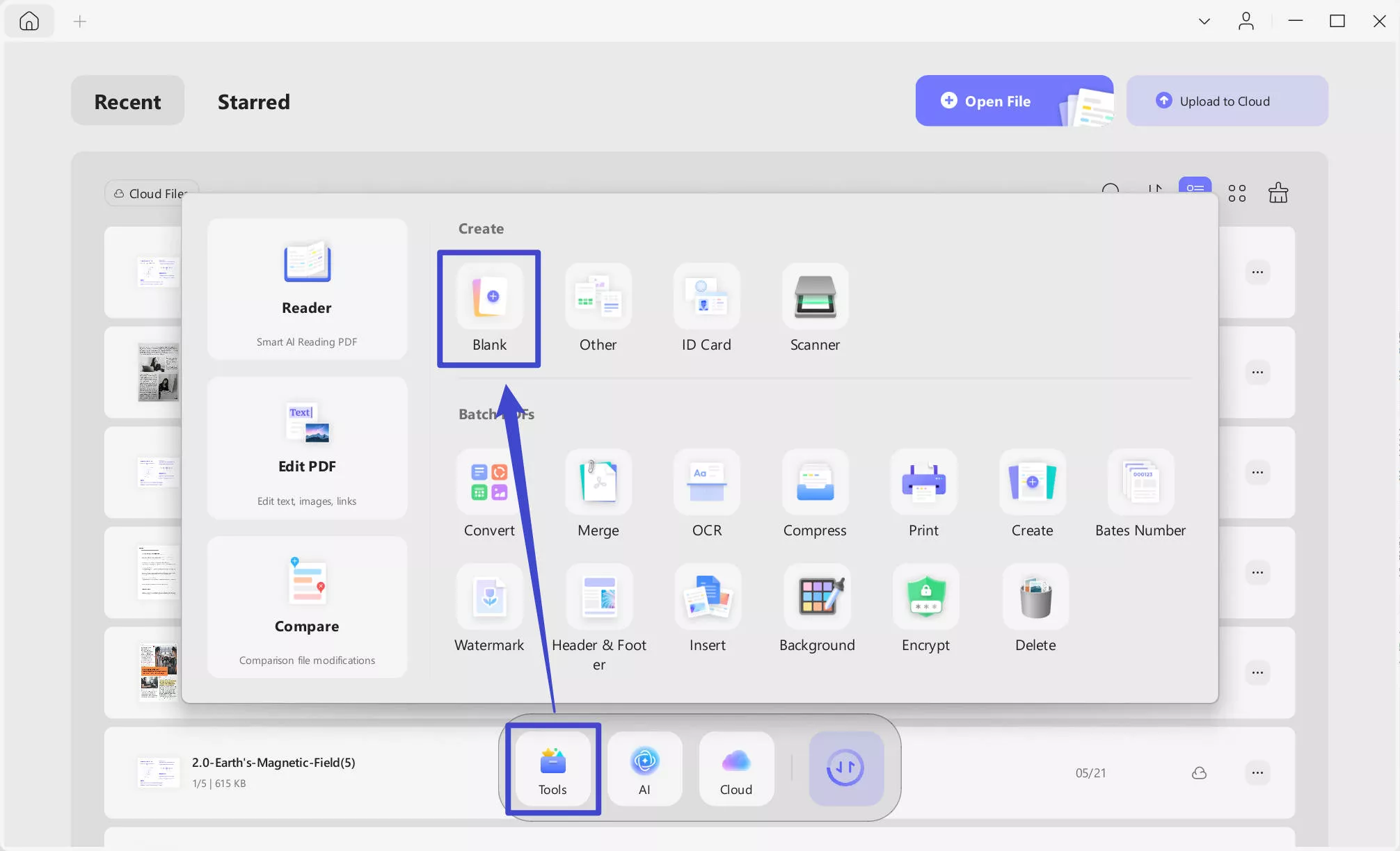
Step 1. As you launch UPDF, access the “Tools” menu for Create from the main home page. Now, choose the Blank option and enter the number of pages, choose paper style, and other settings before clicking the Apply button to proceed.
Tips
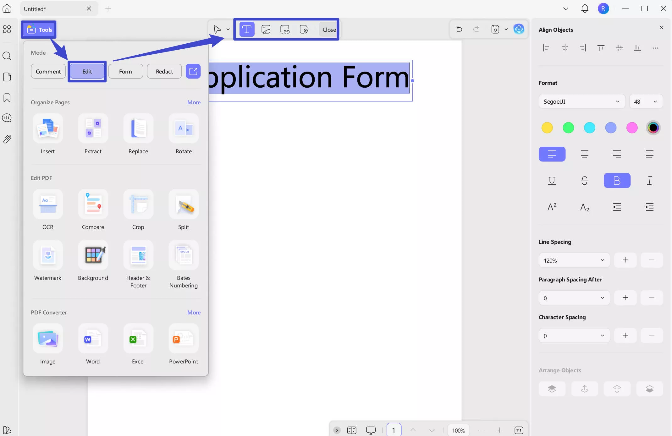
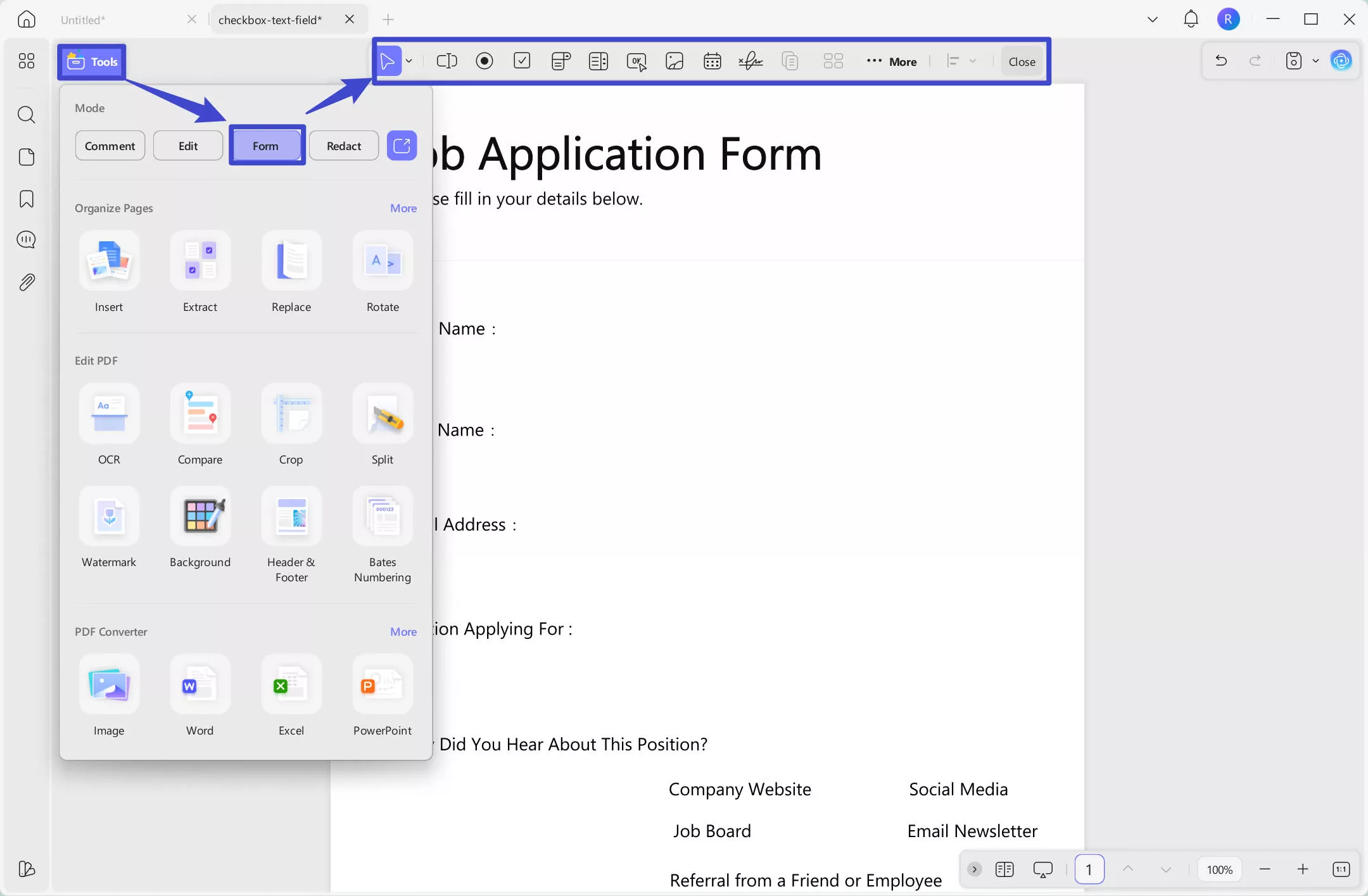
Step 2. With the blank PDF created, navigate to the Tools option from the top left side. Now, from the Tools menu, choose the Form option to open a list of form editing tools.
- Text Field
On selecting this button, you can draw a text box across the form at any particular place. This is typically done to create a text box across a specific field where you want the responder to enter their information. Just click on the "Text Field" icon at the top menu, go to the place where you want to add, hold the left side of your mouse to draw an area for the responder to fill. Release your mouse when it is done.
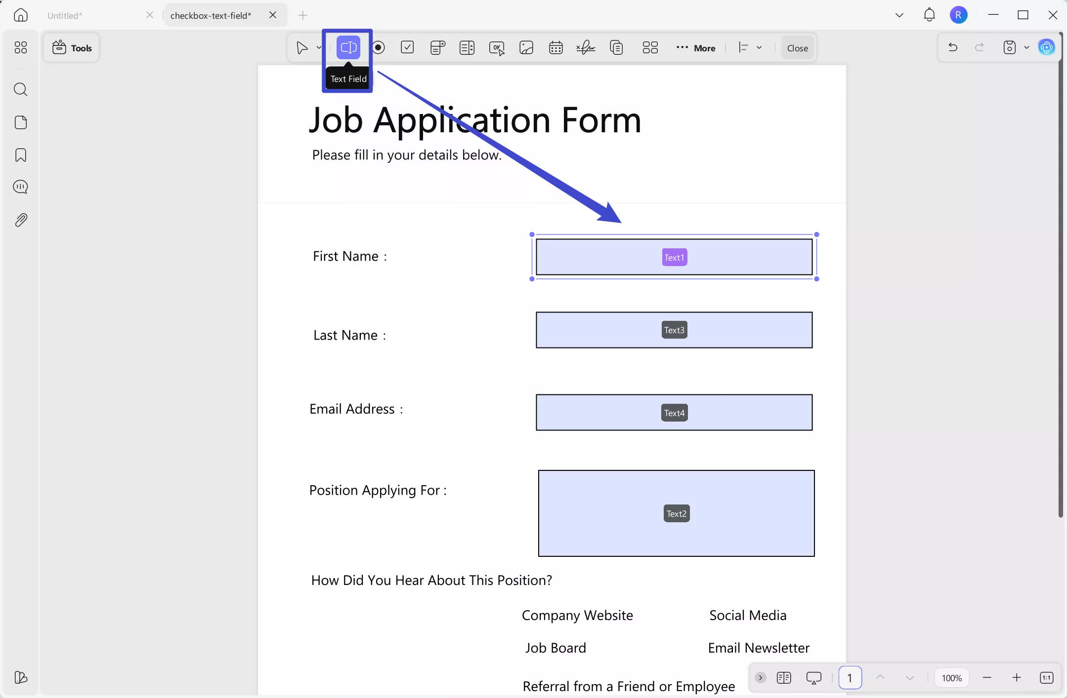
After adding a text field across your blank PDF, you can manage its size using the dotted lines available around the box. Furthermore, you can also drag and drop the text field to change its position across the PDF form.
When double-clicking the text field, its properties panel appears on the right. There, you can change its general properties, style, and action.
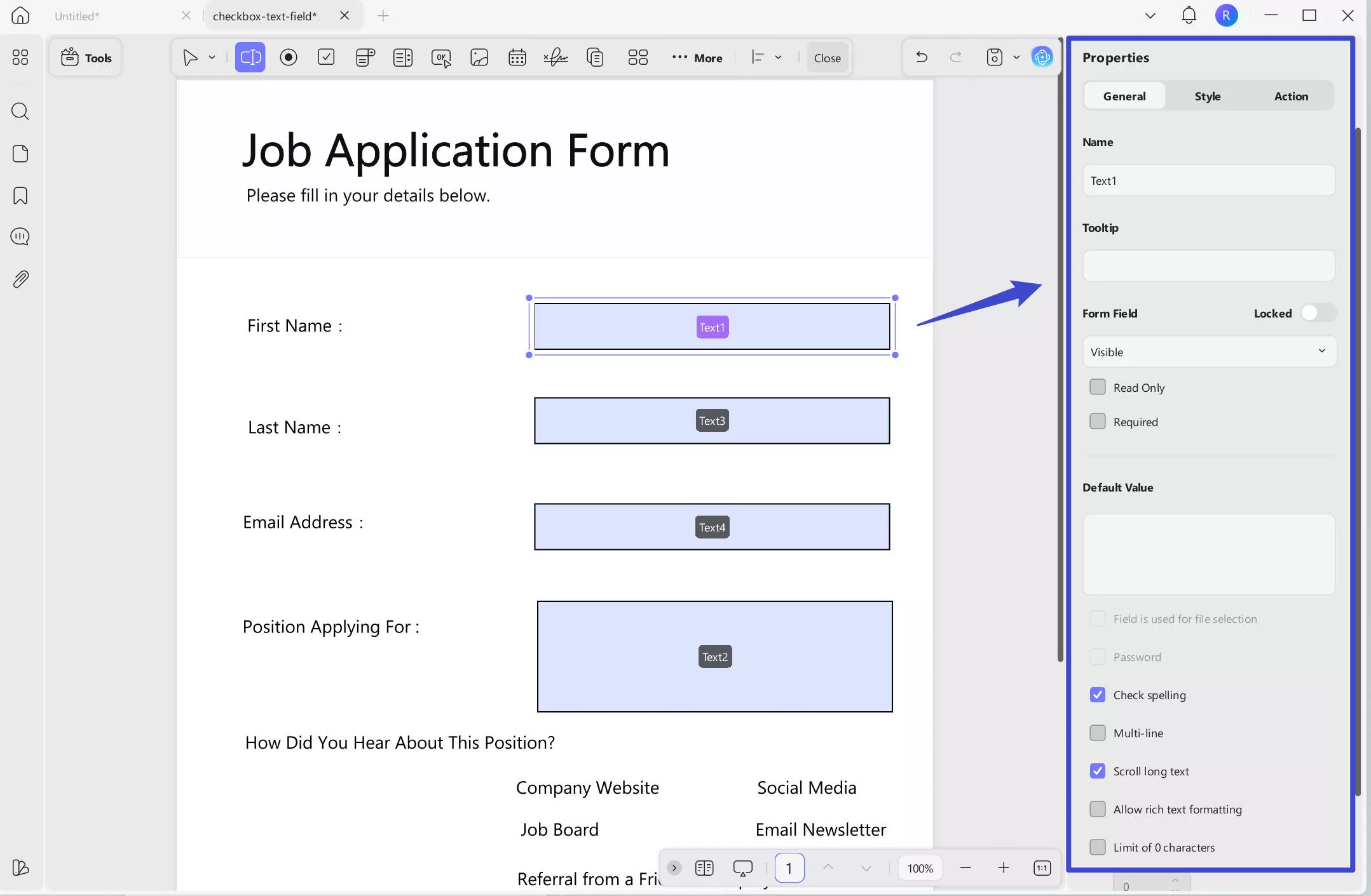
In general properties, you can change the following options:
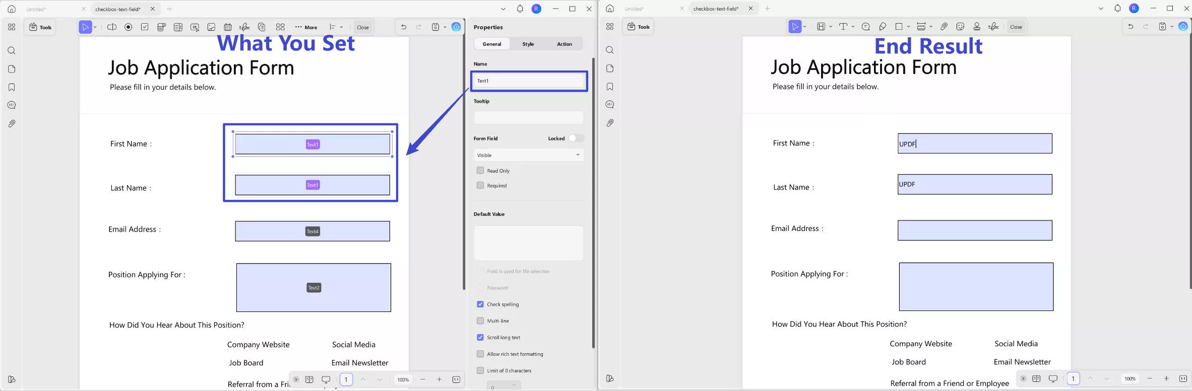
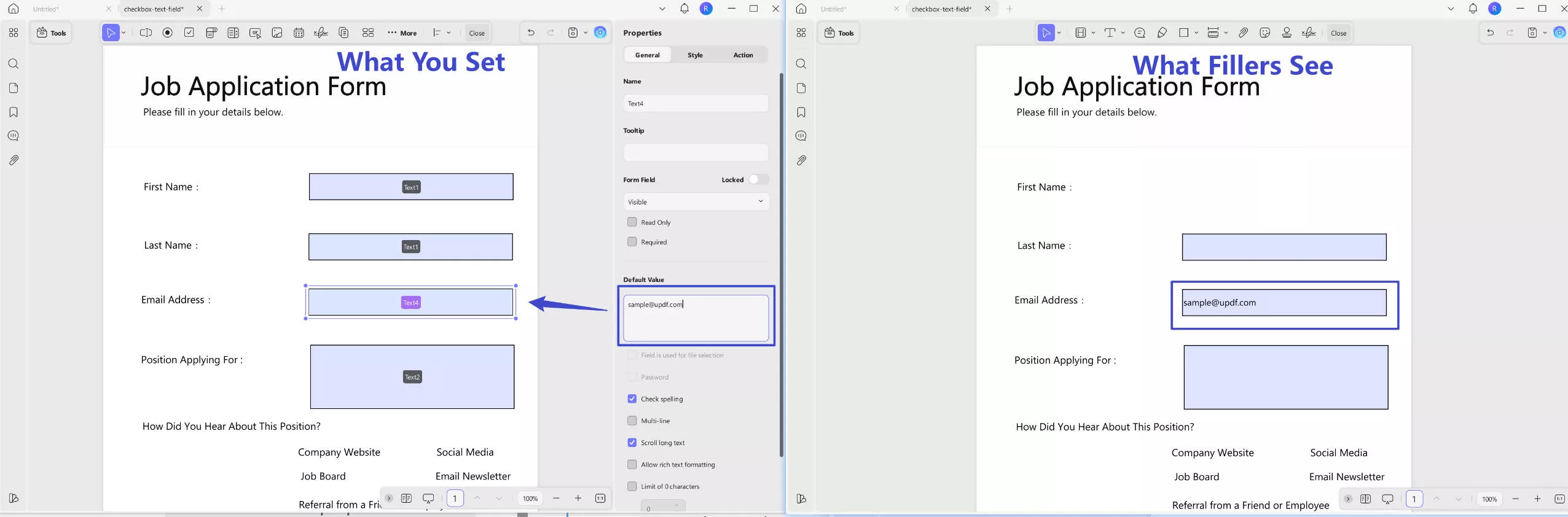
Name: You can rename the selected text field. If you want multiple text fields to automatically display the same content when one is filled, simply give them the same name. For example, to have the second field automatically fill with the same content as the first, name both fields "Text1".
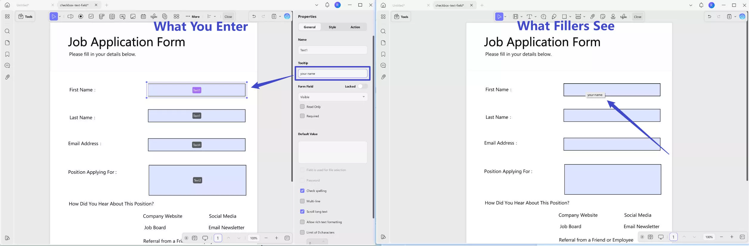
Tooltip: It’s content that appears when you hover over a text field, helping fillers understand what information to enter.
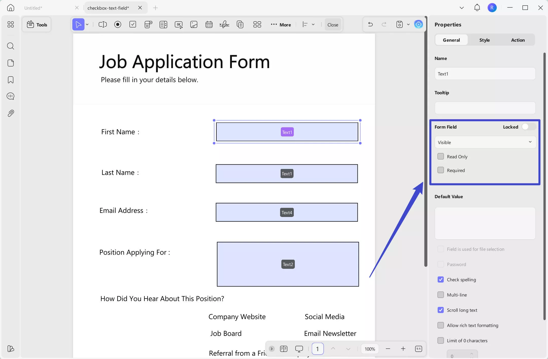
Form Field: You can enable the "Locked" icon to prevent any changes to the selected text field’s properties, such as its size and position. Additionally, you can adjust the field settings as follows:
- Read Only: Prevents users from entering any information.
- Required: Ensures users must fill out the field before submitting.
- Visible: The field is both viewable and fillable.
- Hidden: The field is not visible to users.
- Visible but does not print: The field is shown on screen but won’t appear in printouts.
- Hidden but printable: The field is not visible on screen but will appear when printed.
Default Value: You can set a default value for the field if the content is fixed and known in advance. Users can still delete the default value and enter their own if needed.
You can also configure the following settings:
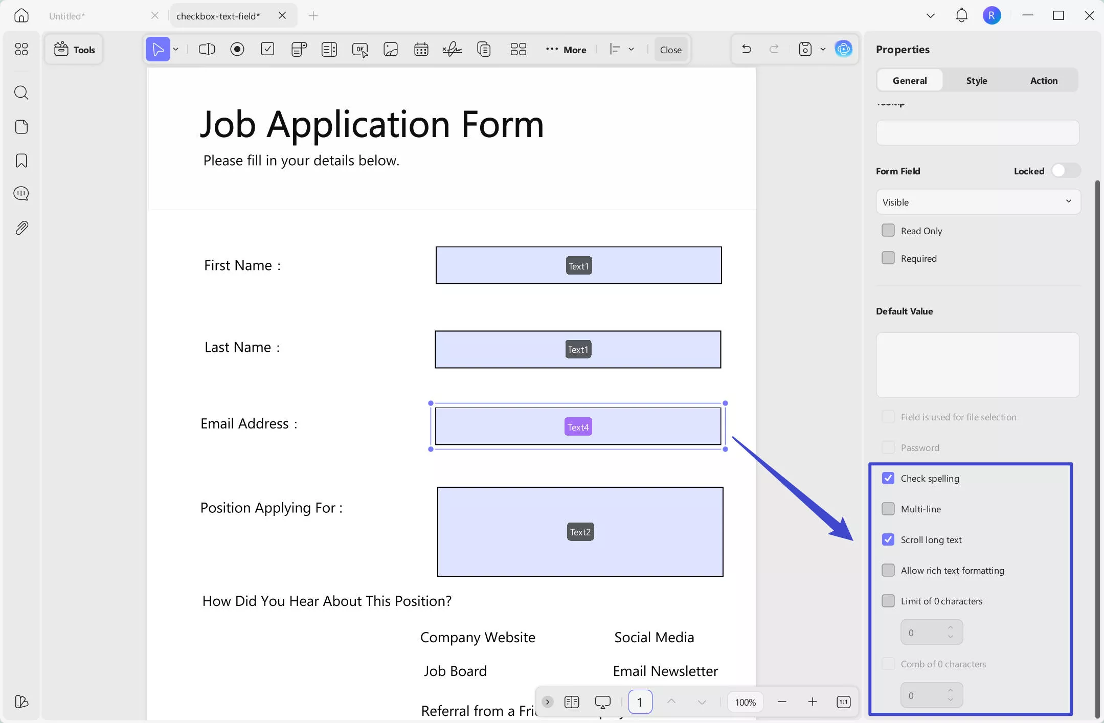
- Check Spelling: Enables spell check to verify the accuracy of the filler’s input.
- Multi-line: Allows the filler to enter content across multiple lines if the text exceeds the field size.
- Scroll Long Text: Enables scrolling within the field when the entered text is longer than the visible area.
- Allow Rich Text Formatting: Allows fillers to apply formatting (such as bold or italic) to the input text.
- Limit of Characters: Sets a maximum number of characters allowed in the field.
Watch the video about General Properties of Text Fields:
In the Style section, you can customize the background color of the text field, the text color for user input, font style, font size, and text alignment. You can also resize the text field by adjusting its width and height.
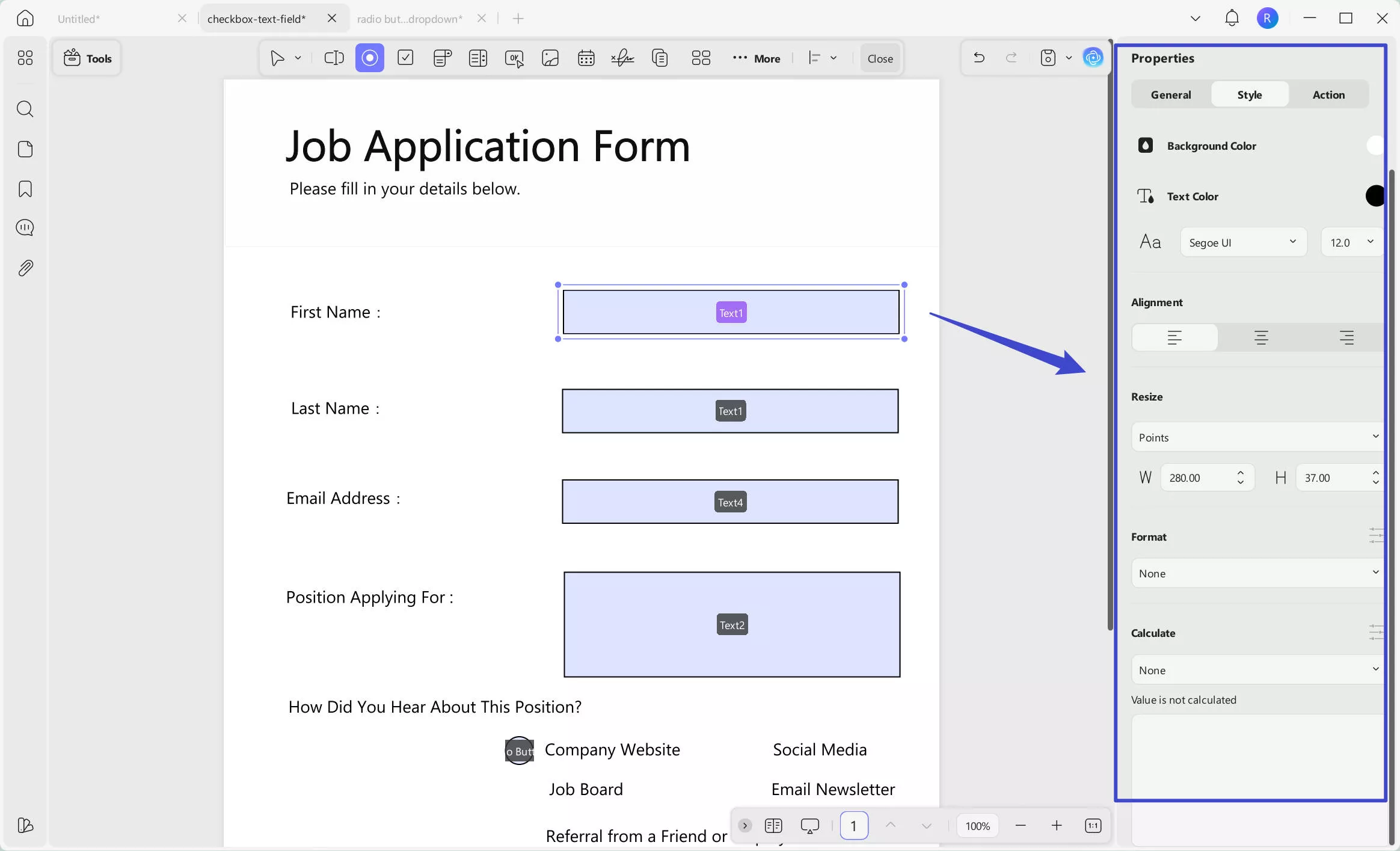
You can also set a specific format for the text field, such as number, percentage, date, time, or other special formats. Once a format is selected, you can customize its related properties. For example, if you choose "Number", you can adjust settings like decimal places, separator style, currency symbol, symbol position, and negative number format.
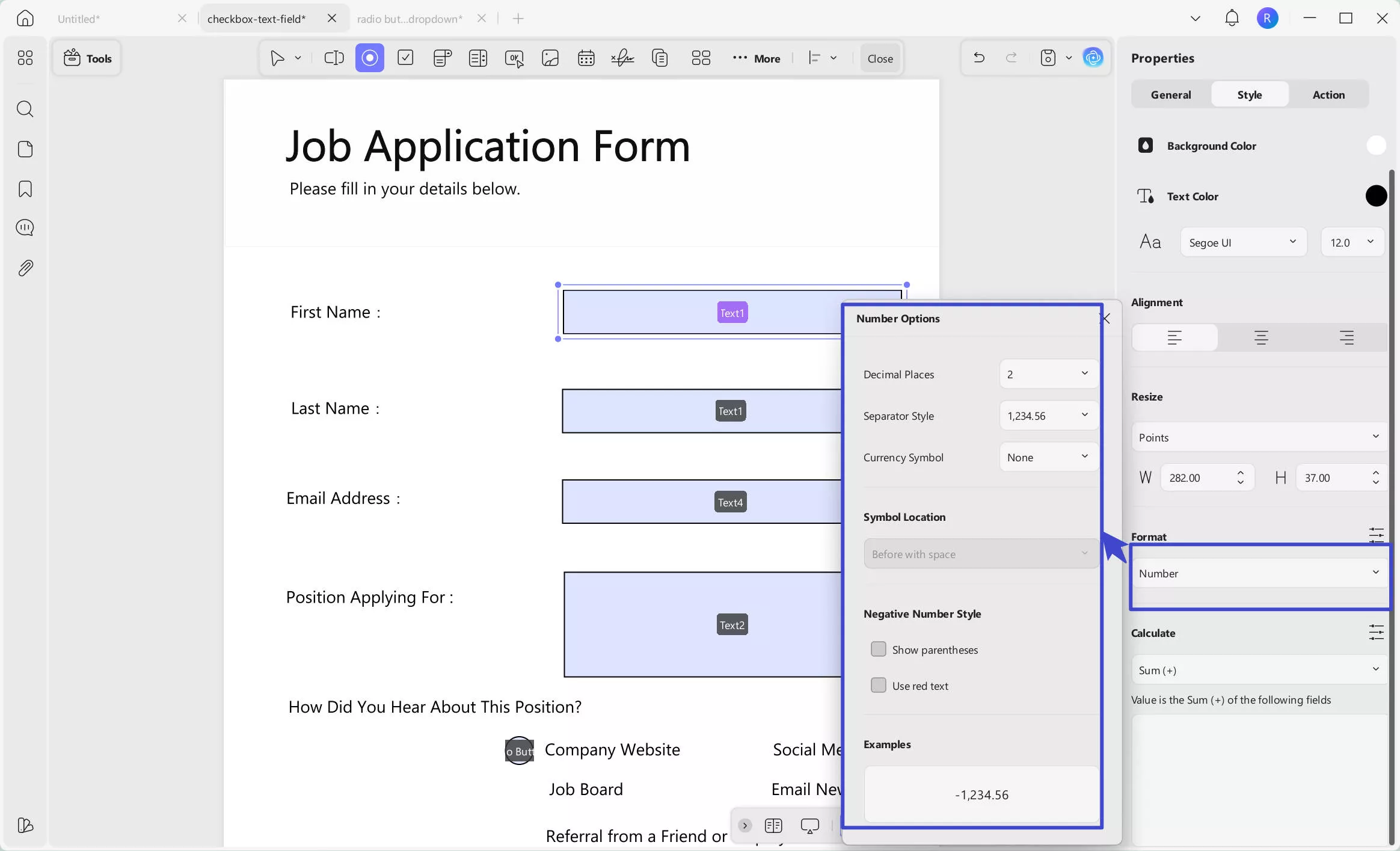
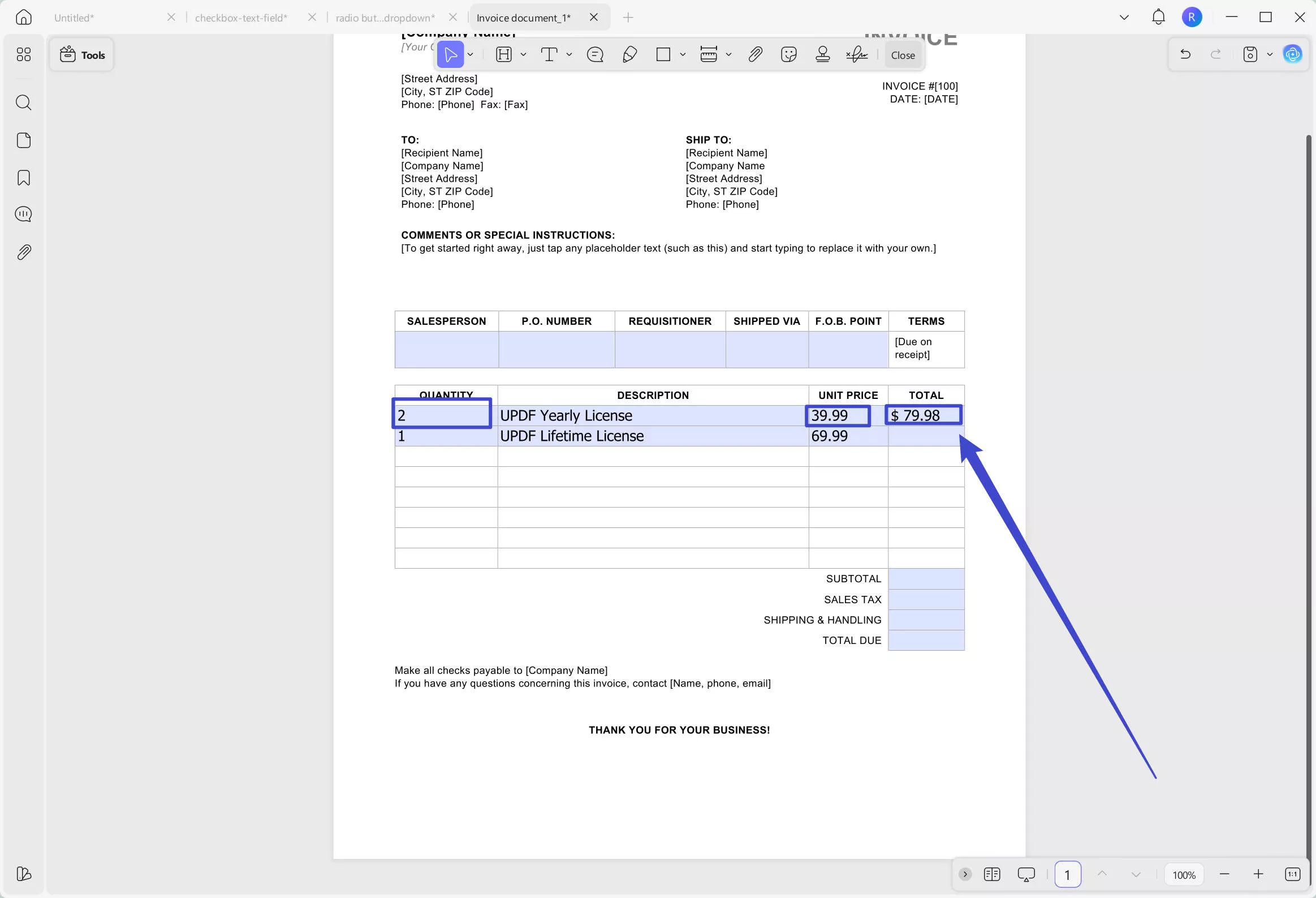
In some cases, especially with number-formatted fields, you may need to perform calculations. You can do this in the Calculate section, where five options are available: Sum (+), Product (×), Average, Minimum, and Maximum.
For example, if you want to calculate the "Price" by multiplying the "Unit" field by the "Quantity" field, simply click on the "Price" text field, choose Product (×), then select "Unit" and "Quantity" from the popup list. Click anywhere outside the list to save your settings.
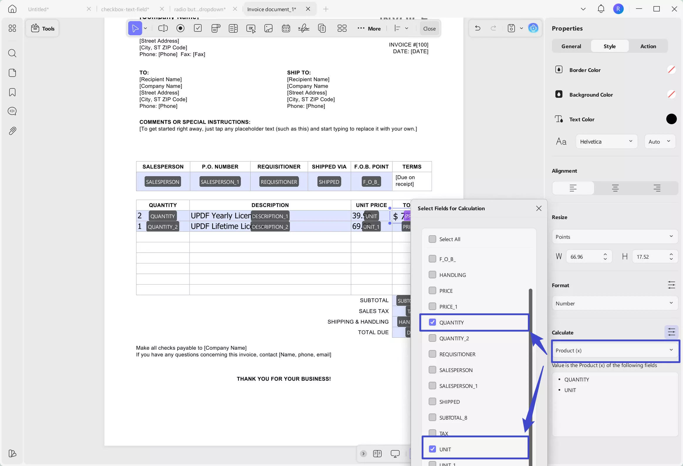
Now, when users enter the quantity and unit price, the total price will be automatically calculated and displayed in the designated field based on your settings.
Watch the video about Style and Calculate Text Fields:
- Radio Button
When you select a single option from multiple choices, a radio button serves best. For this case, access the Radio Button option on the top toolbar to add it to the PDF. If you are creating a group of these buttons, the names should align and should be the same if you need to choose only one option.
When you double-click the button, it will display a Properties panel on the right side, providing the following adjustment capabilities:
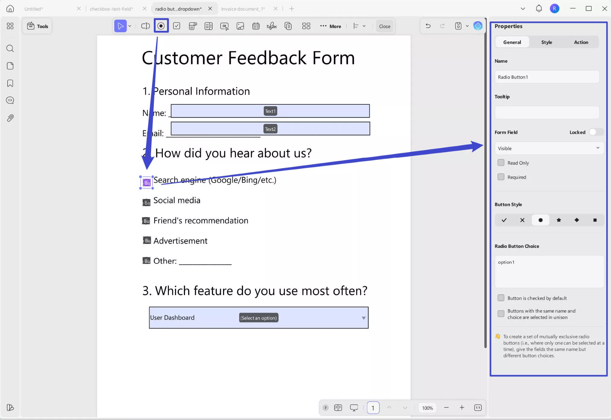
Same as text field, it also has the Name Tooltip, and Form Field settings. The functions are the same. The different settings for Radio button are following ones:
- Button Style: Choose from various button styles such as “√”, “X”, “·”, and others to customize the appearance of the selection indicator.
- Radio Button Choice: Enter the choice value here to define what will be recorded when the form is exported. This ensures accurate tracking of user selections.
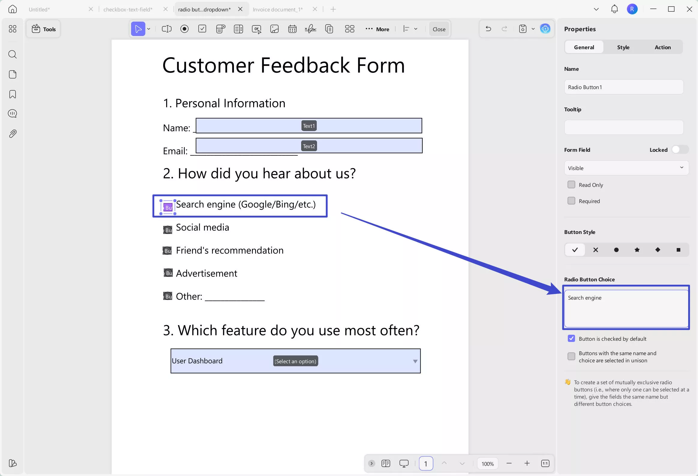
- Button is checked by default: Pre-selects the radio button when the form opens, but users can still choose another option.
- Same name and choice selected in unison: Radio buttons with the same name and choice value are selected together, keeping them synced across the form.
You can also switch to the style section to customize its border color, background color, and resize it.
- Check Box
A checkbox allows users to select one or more options in a PDF form. To add one, select Check Box from the top toolbar and draw it on the form. Double-click the checkbox to access its properties, including Name, Tooltip, and Form Field settings. Like radio buttons, you can customize the button style and set an export value. You can also enable the "Checked by default" option to pre-select the checkbox.
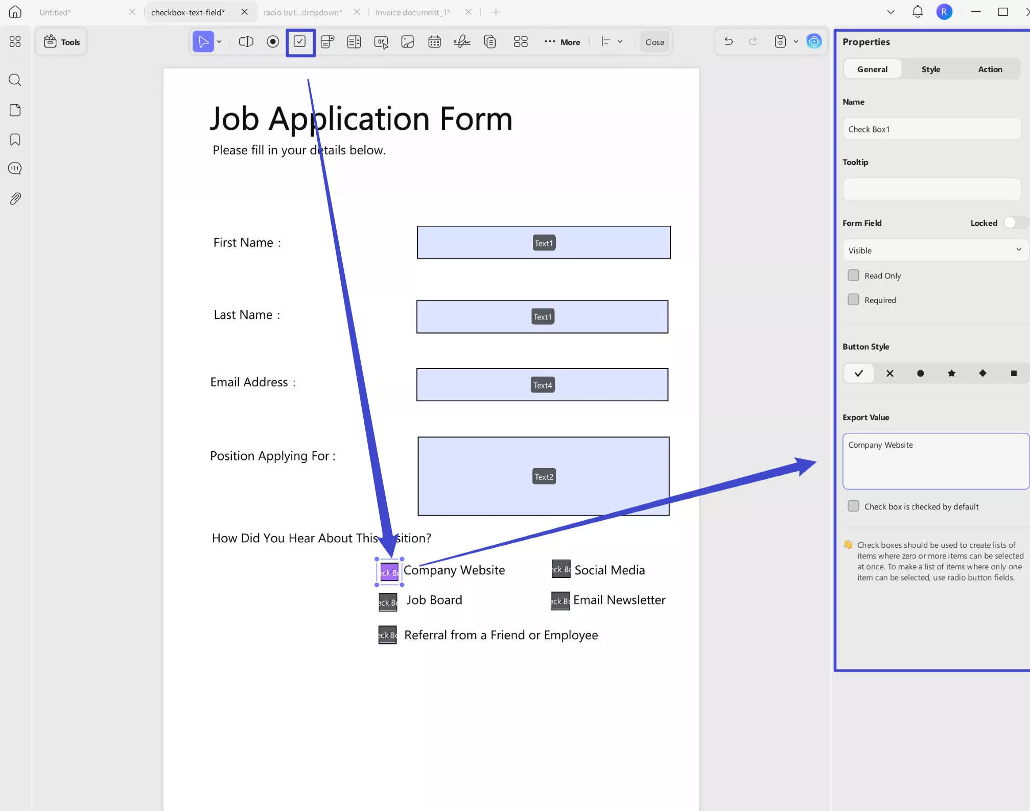
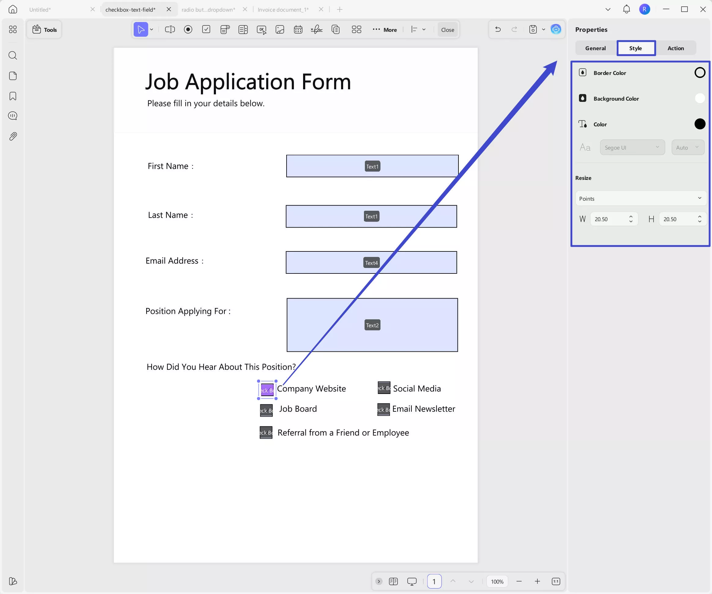
You can also go to the "Style" section to customize its appearance, like border color, background color, and resize it.
Watch the video below to learn How to Add Radio Button & Check Box:
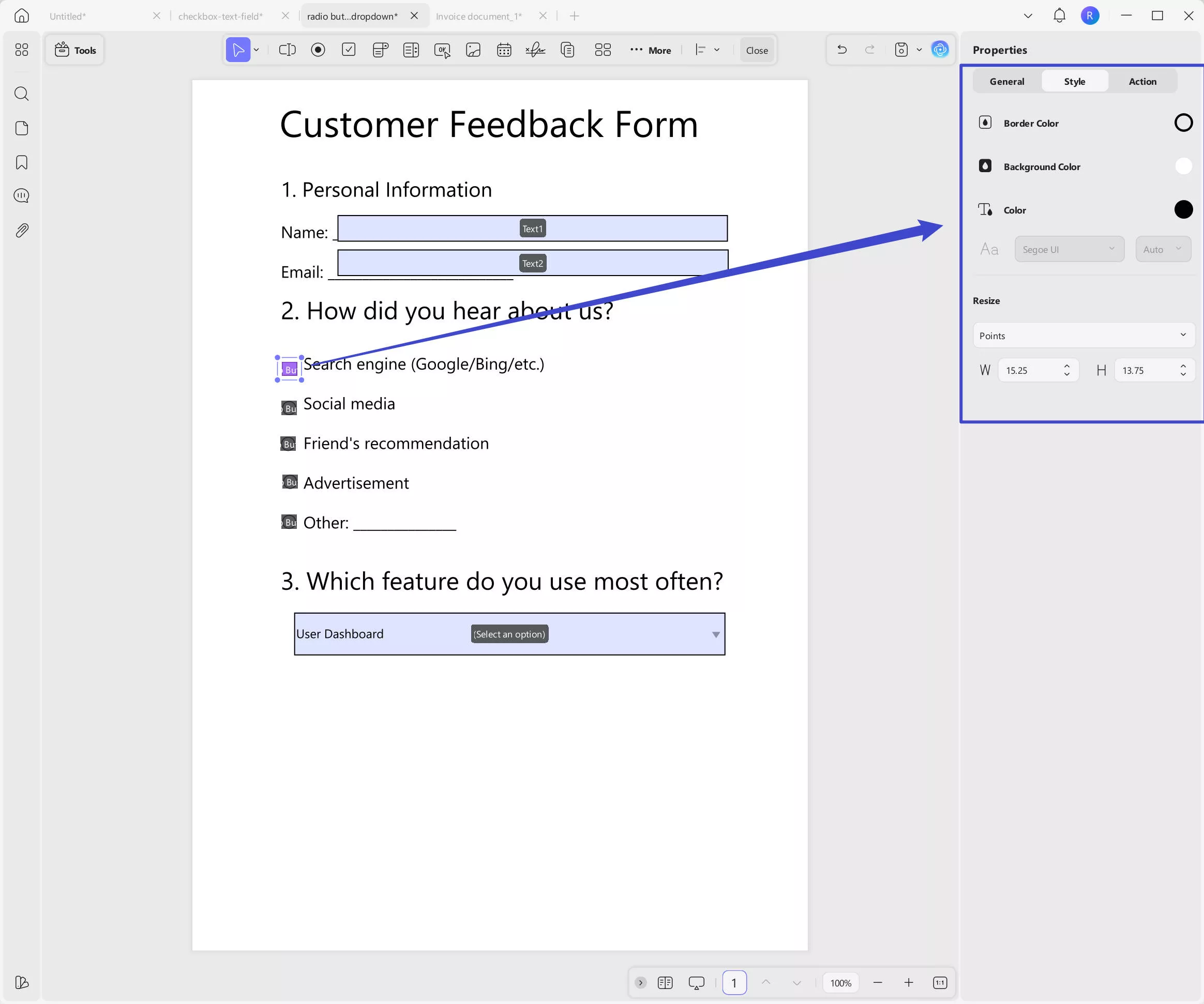
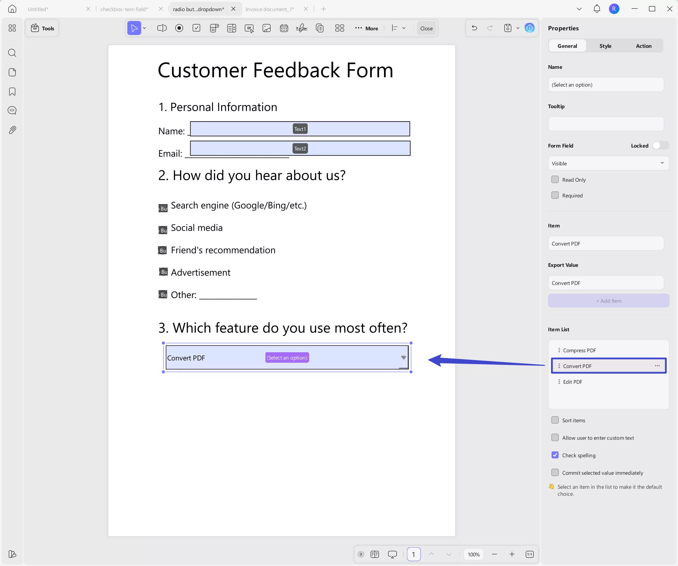
- Dropdown
Using this option, a dropdown menu can be created within the form, giving the responders multiple options to select from. Just click on the "Dropdown" icon at the top, draw to create the dropdown in your PDF form, then, double click to get the properties panel.
You can rename the field, add a tooltip, and adjust the form field settings as needed.
Next, add items to the dropdown list by entering the option label under Item, and an export value if required. Click "+ Add Item" to insert it. Repeat this process for each additional option you want to include.
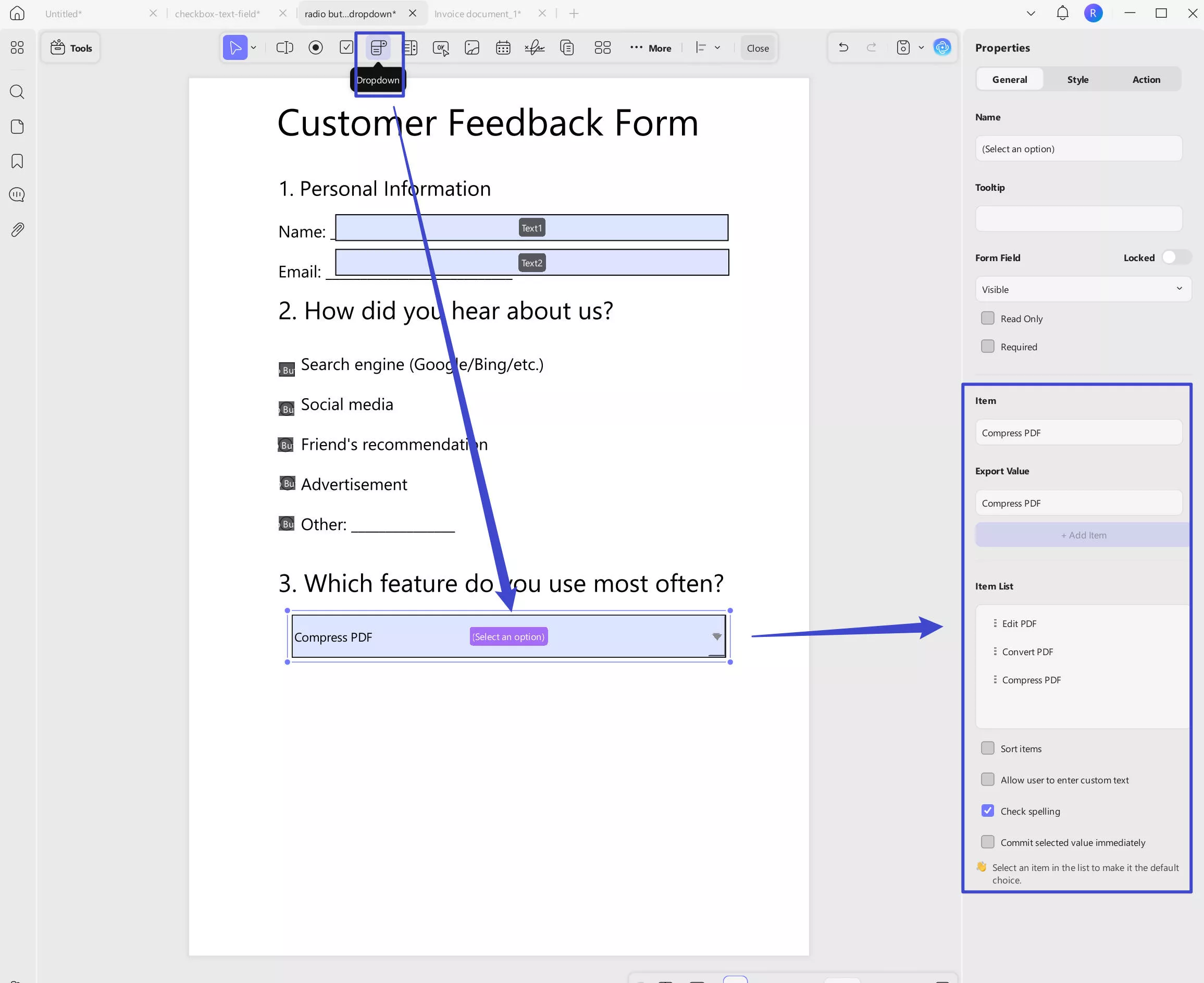
After adding all the items, you can sort the items by checking "Sort Items". With this option, it will sort by the first letter in the word. If you need to sort manually, you click on the "Three Dots" behind each item to "Move Down" or "Move Up".
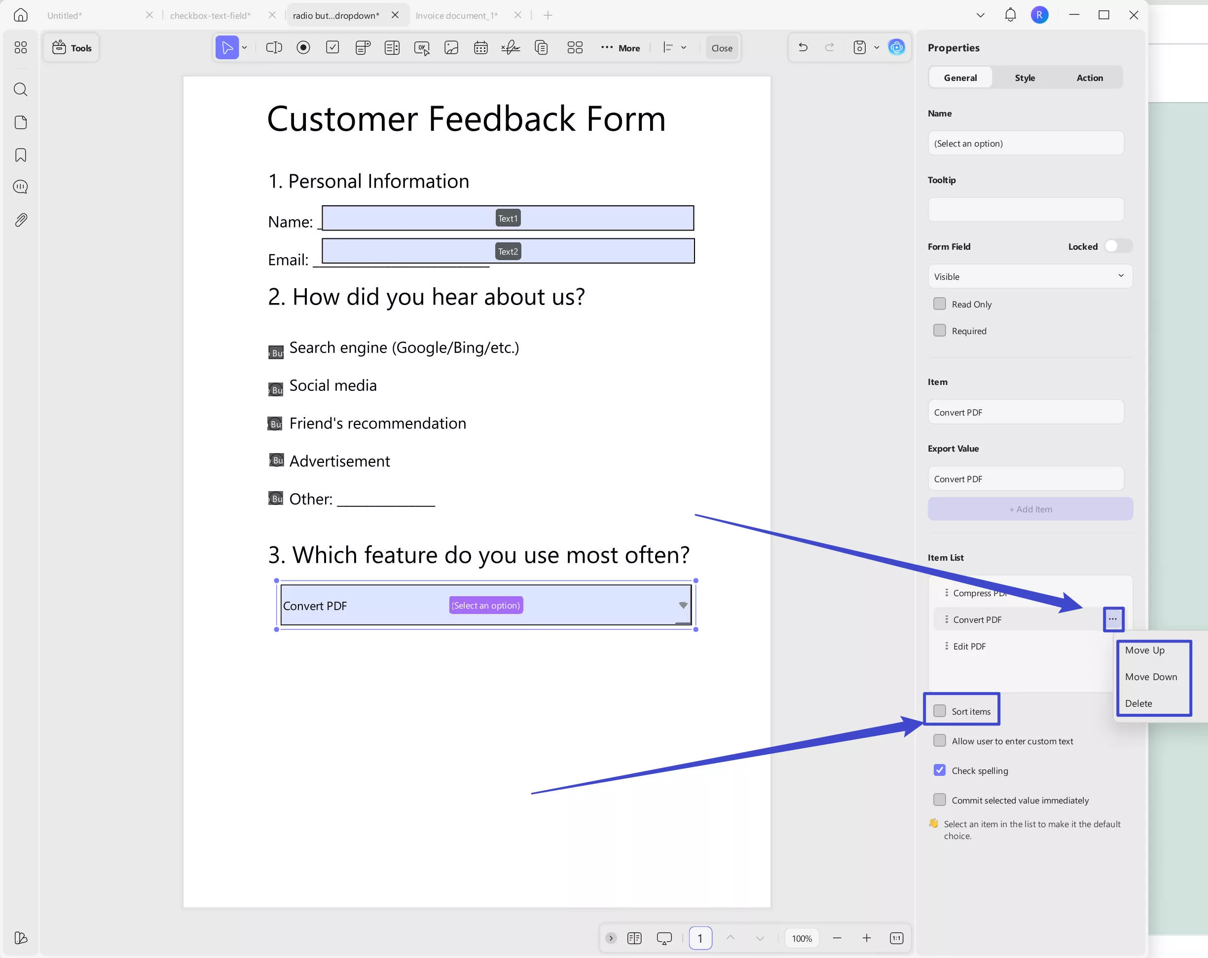
You can also have the following options.
- Allow user to enter custom text: Let fillers type their own input instead of selecting from the predefined options.
- Check spelling: Enables spell check on the filler's input.
- Commit selected value immediately: Instantly applies the selected value without requiring the user to click outside the field.
Want to set a default selection? Simply click on the desired item in the Item List section.
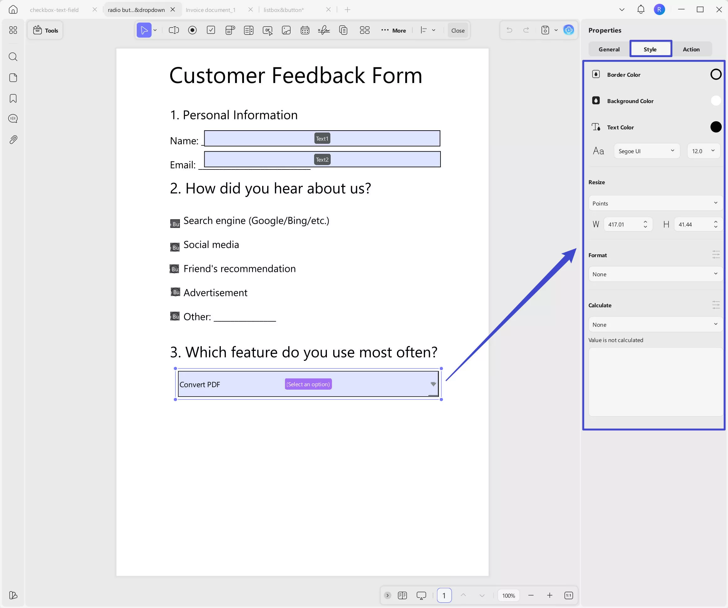
To customize the style of the drop-down list, click on Style in the right-side panel. From there, you can change the border color, background color, text color, font style, and size, as well as adjust the size of the drop-down list. You can also set a format and add calculations if needed.
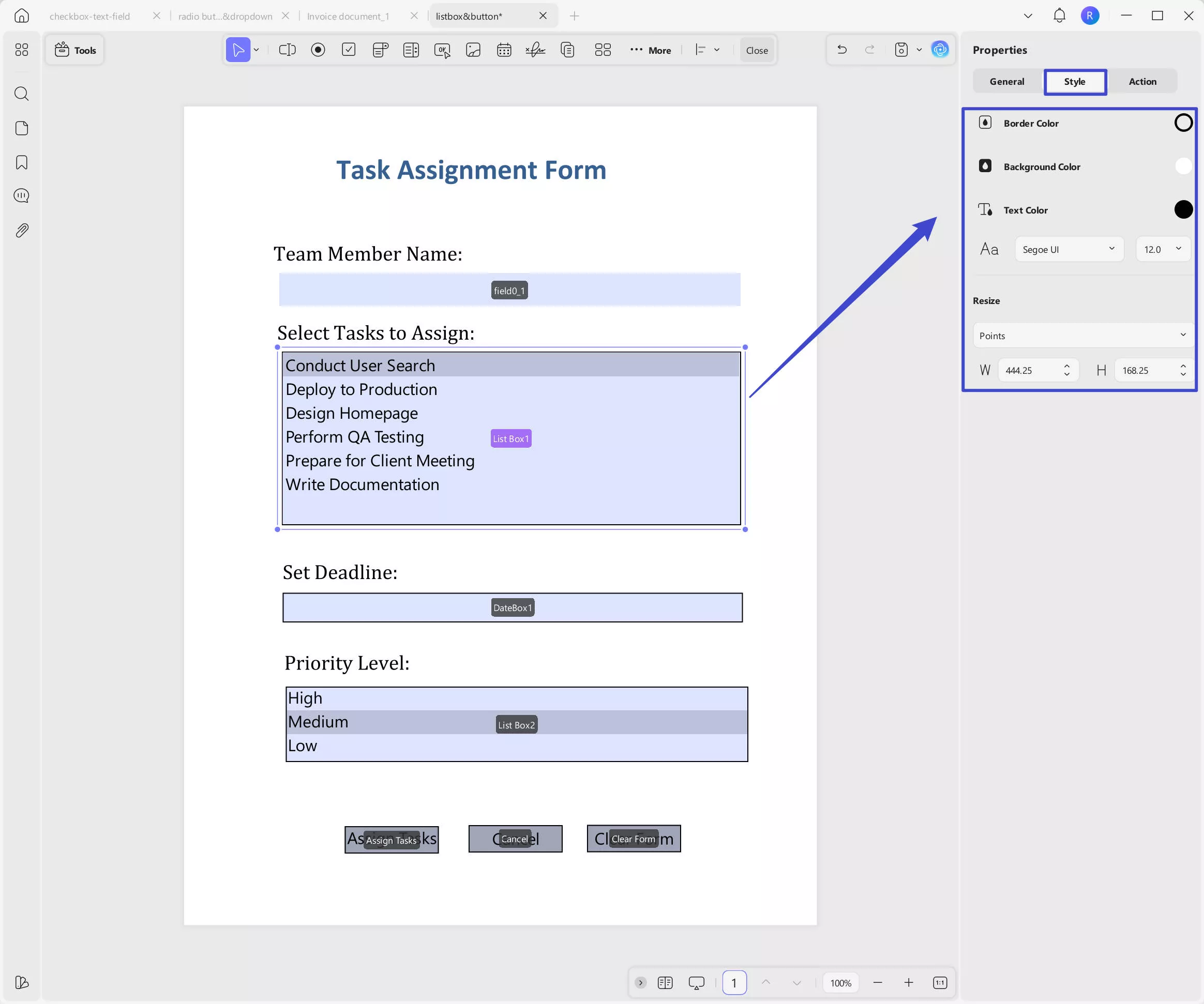
- List Box
If your PDF form requires you to list all options while allowing the responder to select one or more options, a list box is the perfect utility to include. Just click on the "List Box", draw to add the list box in the form, and double click to get the properties panel. Name, add the tooltip, and change the form field settings here.
Same as in the drop-down list, enter your item and export value, and click on the "+ Add Item" to add all your options.
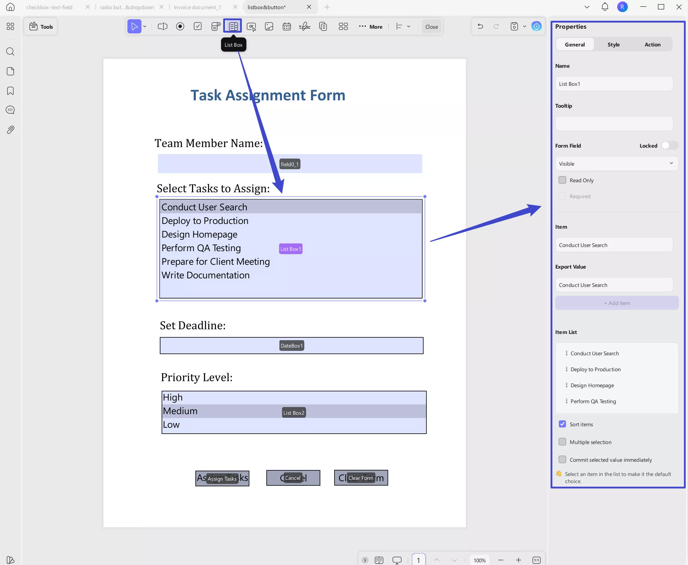
Here, you can also get the following options:
- Sort Items: Automatically sorts the item list alphabetically based on the first letter of each item.
- Multiple Selections: Allows users to select more than one option from the list.
- Commit Selected Value Immediately: Applies the selected value instantly without needing to click outside the field.
You can customize the appearance by clicking on the Style section. There, you can change the border color, background color, text color, font style, font size, and adjust the size of the field.
Watch the video below to learn How to Dropdown & List Box in PDF Forms:
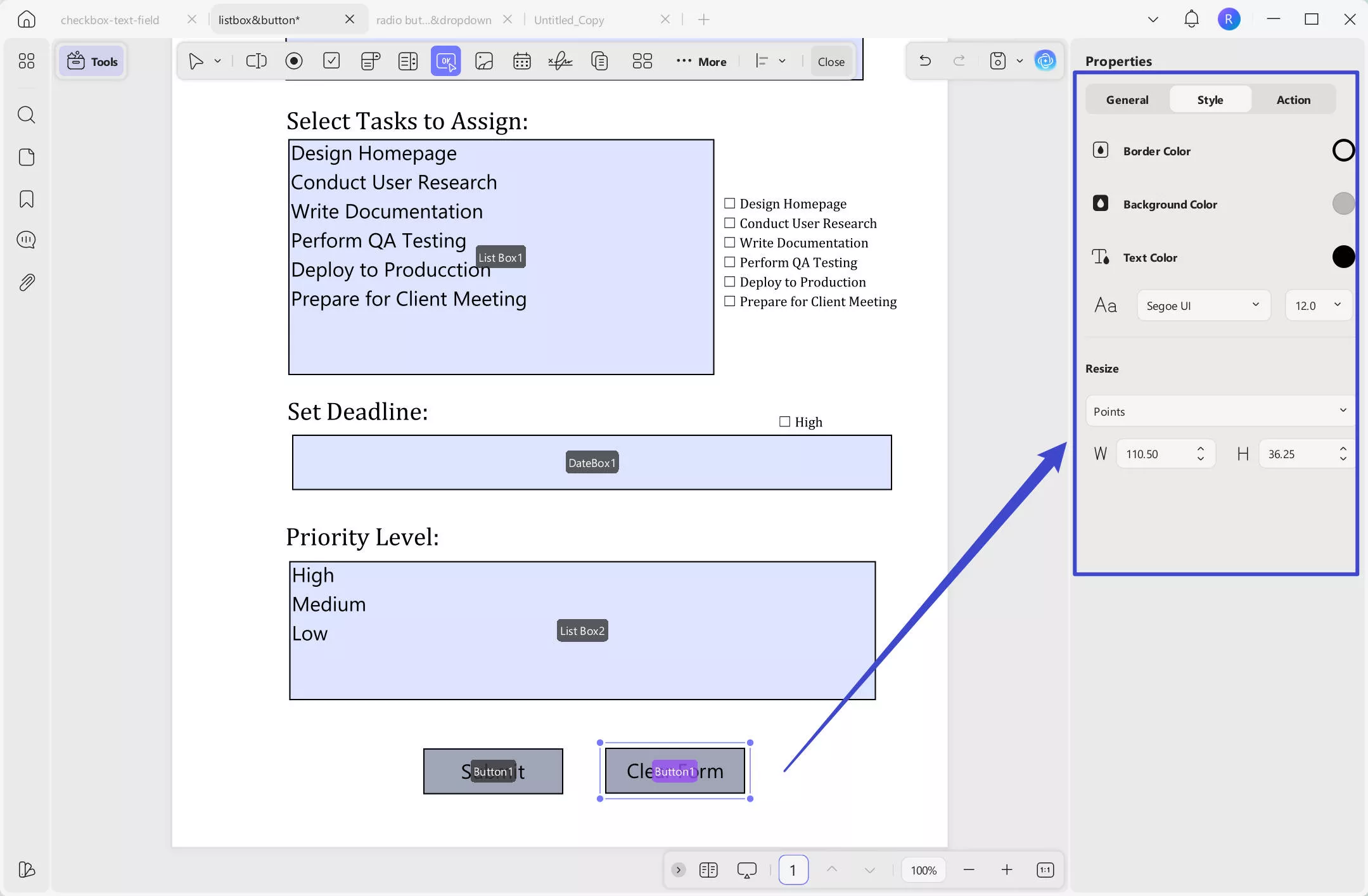
- Button
This element serves best in cases where you are bound to add a specific action within the PDF form. You can use it to create a button to visit the website, go to a specific place in the form, reset a form, show or hide a field, open a file, or import data.
Just click on the "Button" icon at the top menu, then, double click on to get the properties panel. Customize its name, tooltip, form field if needs.
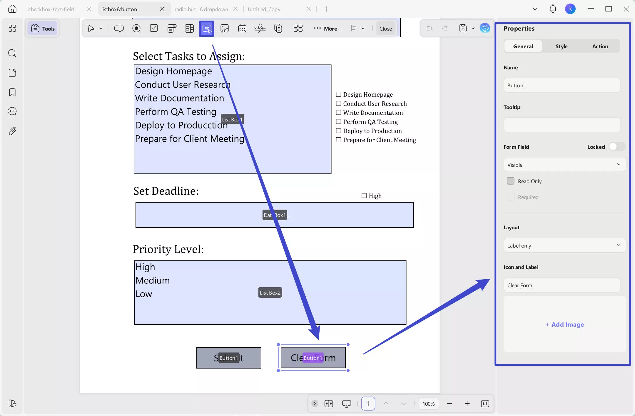
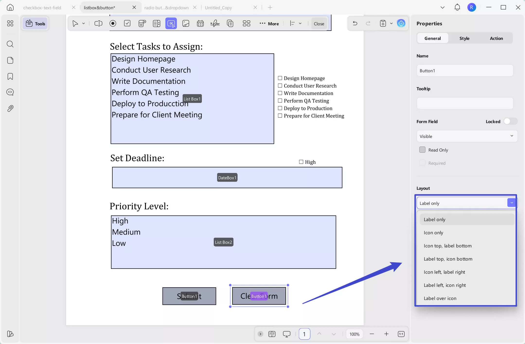
In the Layout section, you can choose from options like "Label Only", "Icon Only", "Icon Top, Label Bottom", "Label Top, Icon Bottom", "Icon Left, Label Right", "Label Left, Icon Right", and "Label Over Icon."
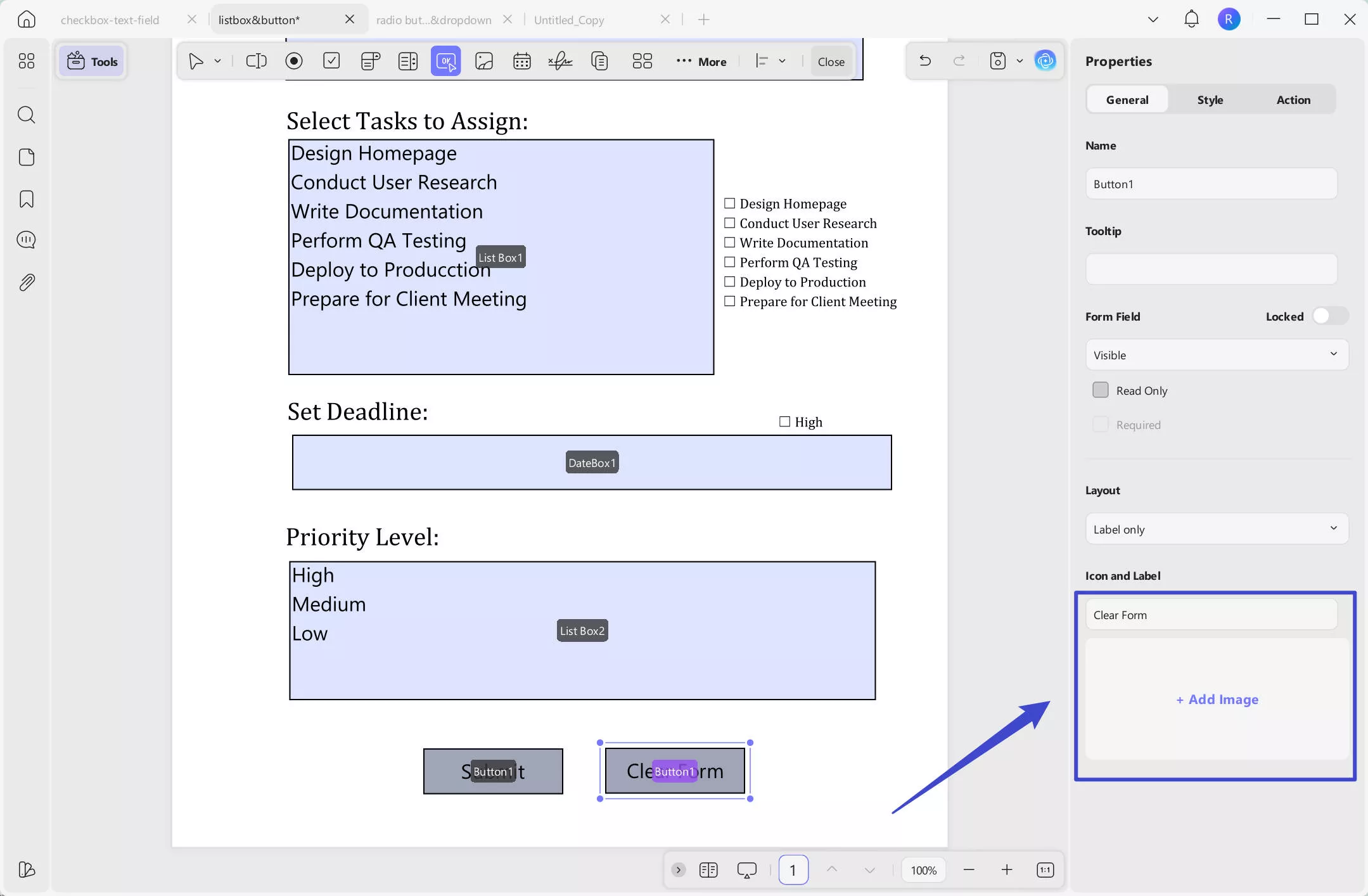
Here, label refers to the button text, and icon refers to the image you can upload later.
After selecting how you want the button text and icon to appear, you can customize them. Enter the button text, and if you’ve chosen a layout that includes an icon, click "+ Add Image" to upload your desired icon.
Same as other options, you can customize its style by clicking on the "Style" option. Here, you can set the color, font style, and resize the button.
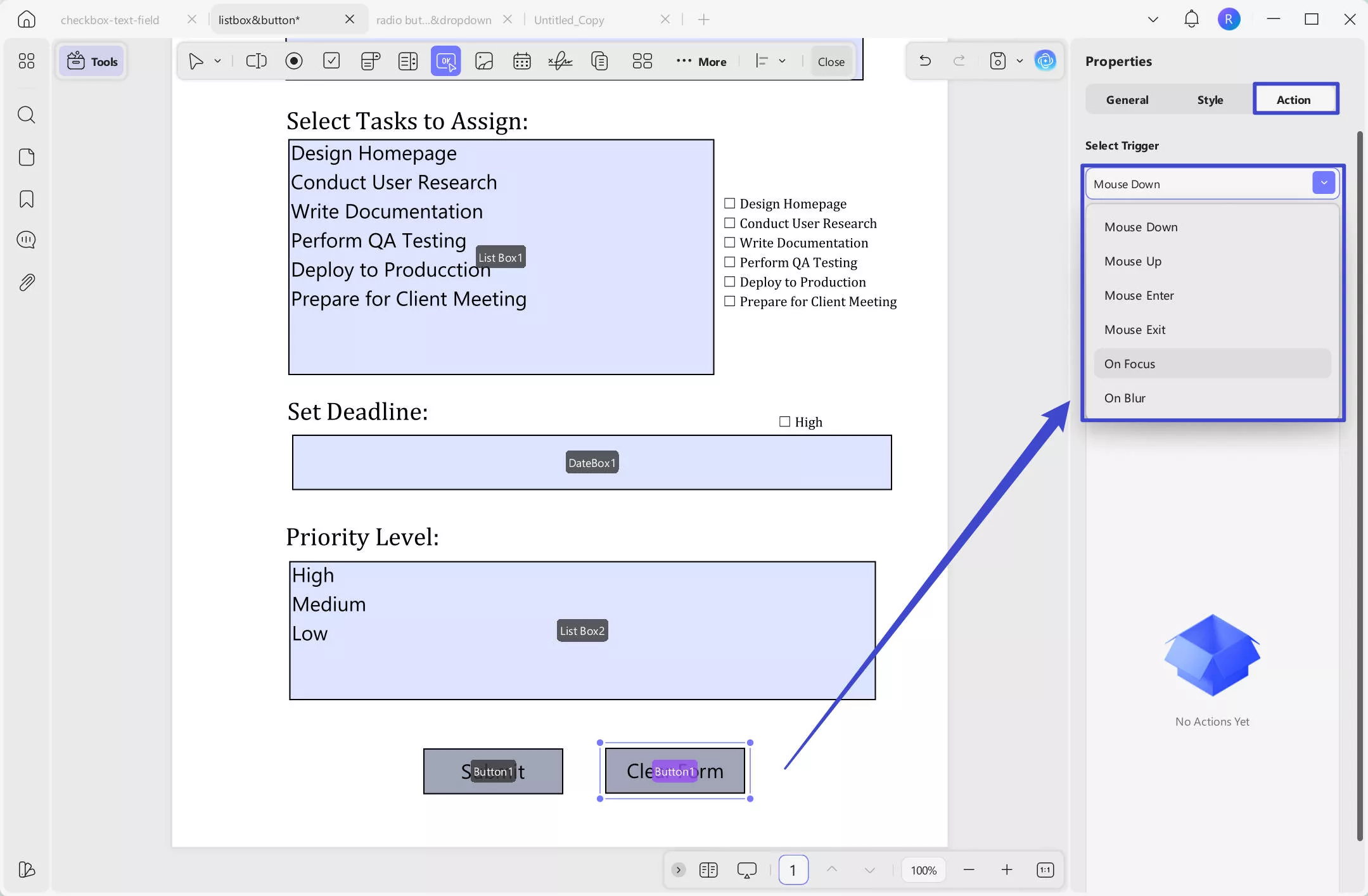
When creating an action button, the most important thing is to set the action. Click on the Actions tab, select a trigger. Here you can have the following options.
Mouse Down:
Triggered when the user presses the mouse button down on the form field, but before releasing it.
Mouse Up:
Triggered when the user releases the mouse button after clicking on the field.
Mouse Enter:
Triggered when the mouse pointer moves over the form field.
Mouse Exit:
Triggered when the mouse pointer moves away or leaves the form field area.
On Focus:
Triggered when the field becomes active or selected (e.g., when a user clicks into a text field to start typing).
On Blur:
Triggered when the field loses focus, meaning the user clicks or tabs away from it.
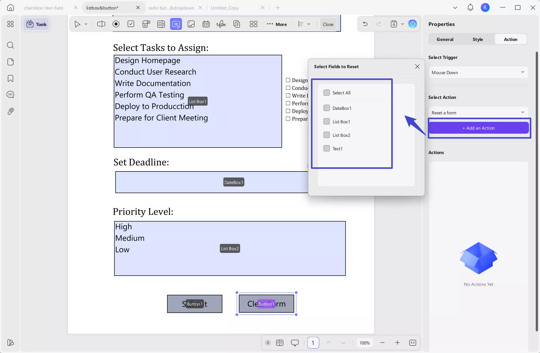
Next, you need to select an action. Here are the options you can have.
Set Destination: Jumps to a specific page in the same PDF.
Open a Web Link: Opens a URL in the browser.
Reset a Form: Clears all filled form data.
Show/Hide a Field: Displays or hides fields based on user actions.
Open a File: Opens another file from your device.
Import Form Data: Fills the form using data from an external file.
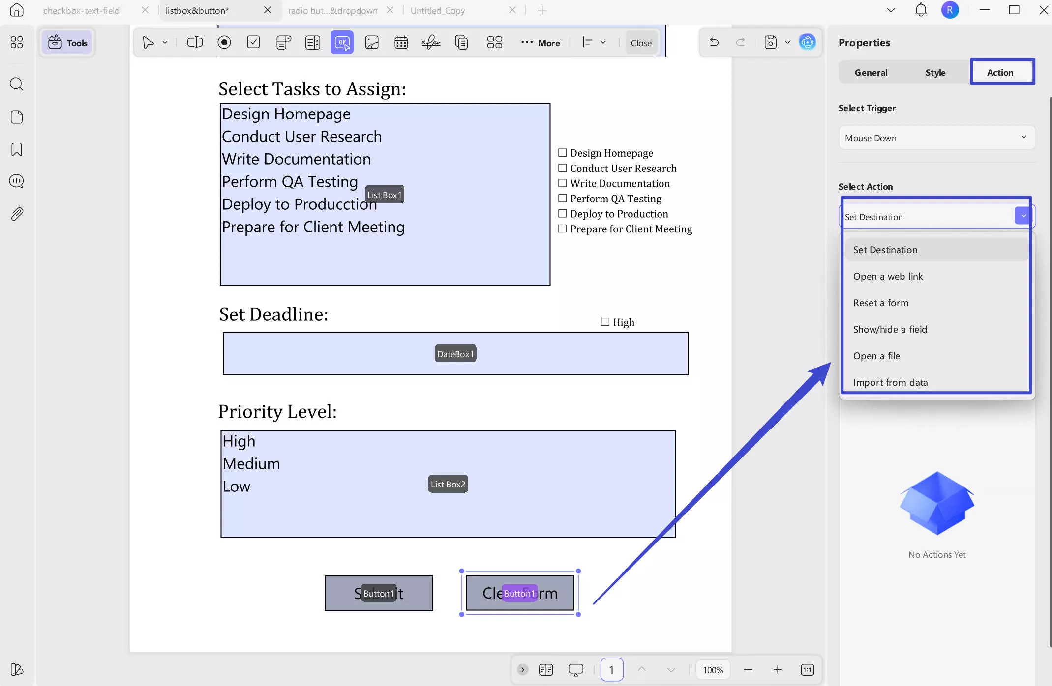
After selecting, you need to click on the "Add an Action" to select fields, enter the webpage, set the destination, etc, per your option.
Watch the video below to learn How To Create and Fill Form with Buttons:
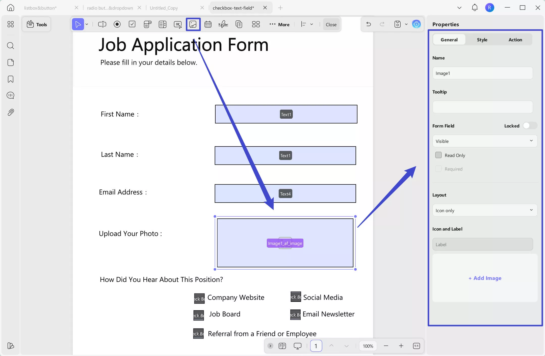
- Image Field
To allow responders to add their images within the PDF form, you can add an Image Field using the toolbar at the top. After drawing a space for the image field, you can customize its properties from the right panel.
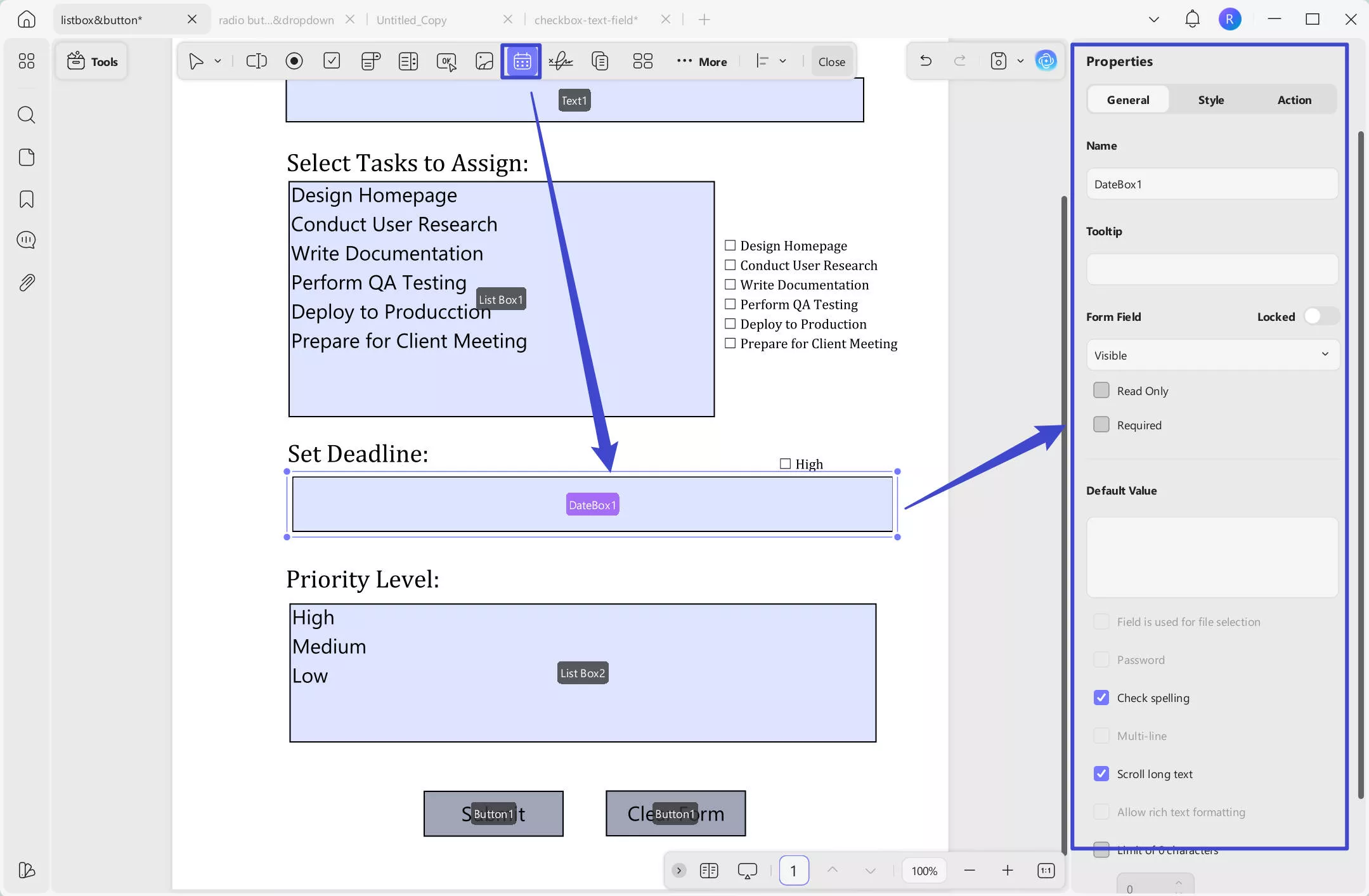
- Date Field
If you consider adding a blank date field for your responders, use the Date Field icon from the top. The field's appearance can be adjusted across the Style section on the right panel.
Watch the video below to learn How To Create and Fill Form in UPDF about image&Date Field:
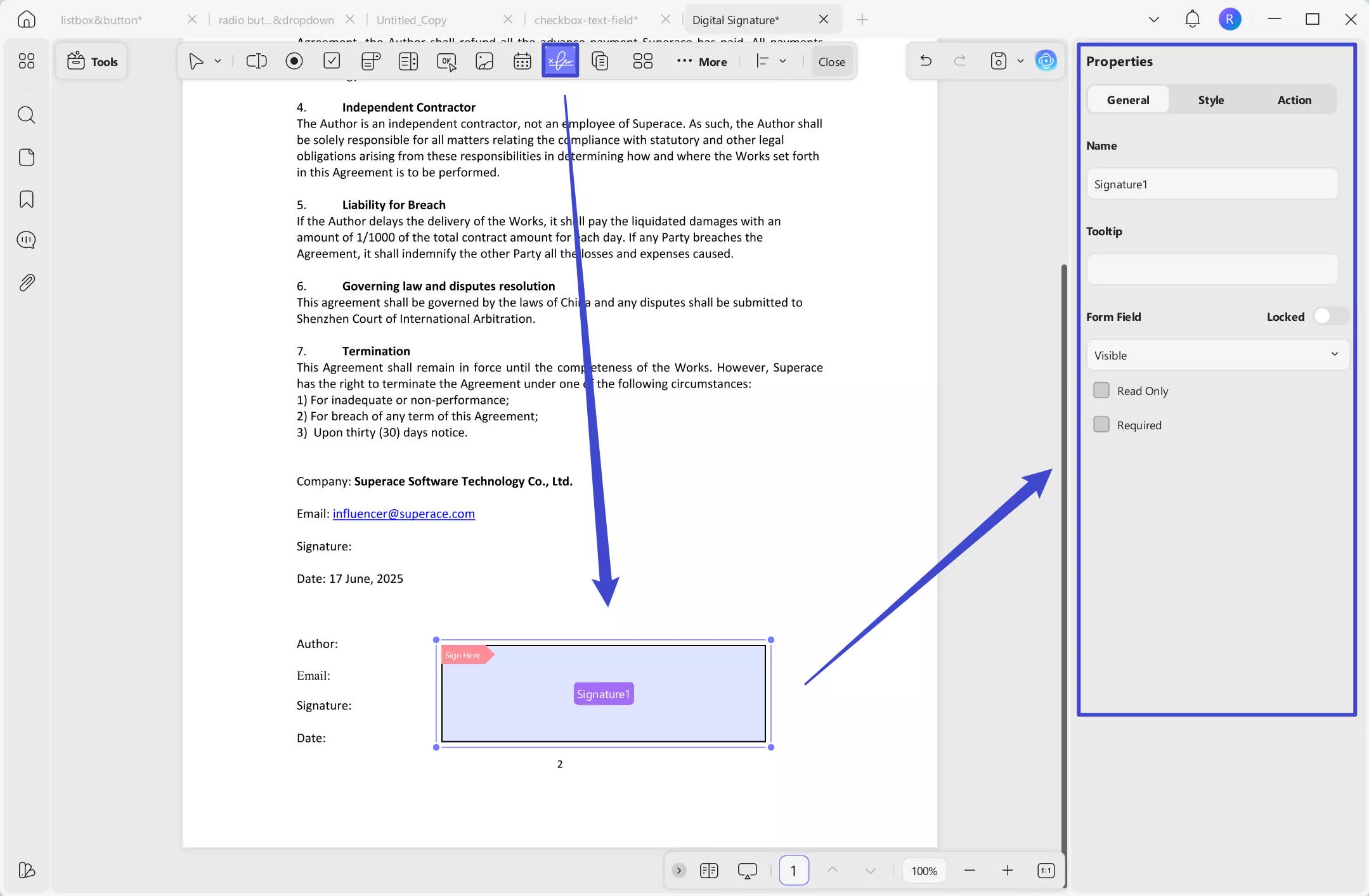
- Digital Signature
This is among the important elements of a PDF form that define the authenticity of the document. To add this across the PDF, access the Digital Signature icon and draw it. Double-click to access its properties on the right panel, which allows you to manage its basic properties, appearance, and assorted actions.
Once you are done with your customizations, navigate to the Save icon on the top right side. After this, you can choose Save As option to save your form to a specific location on your device.
Watch the video below to learn How to Add a signature Field in PDF Forms:
2. Automatic Creation of PDF Fillable Forms
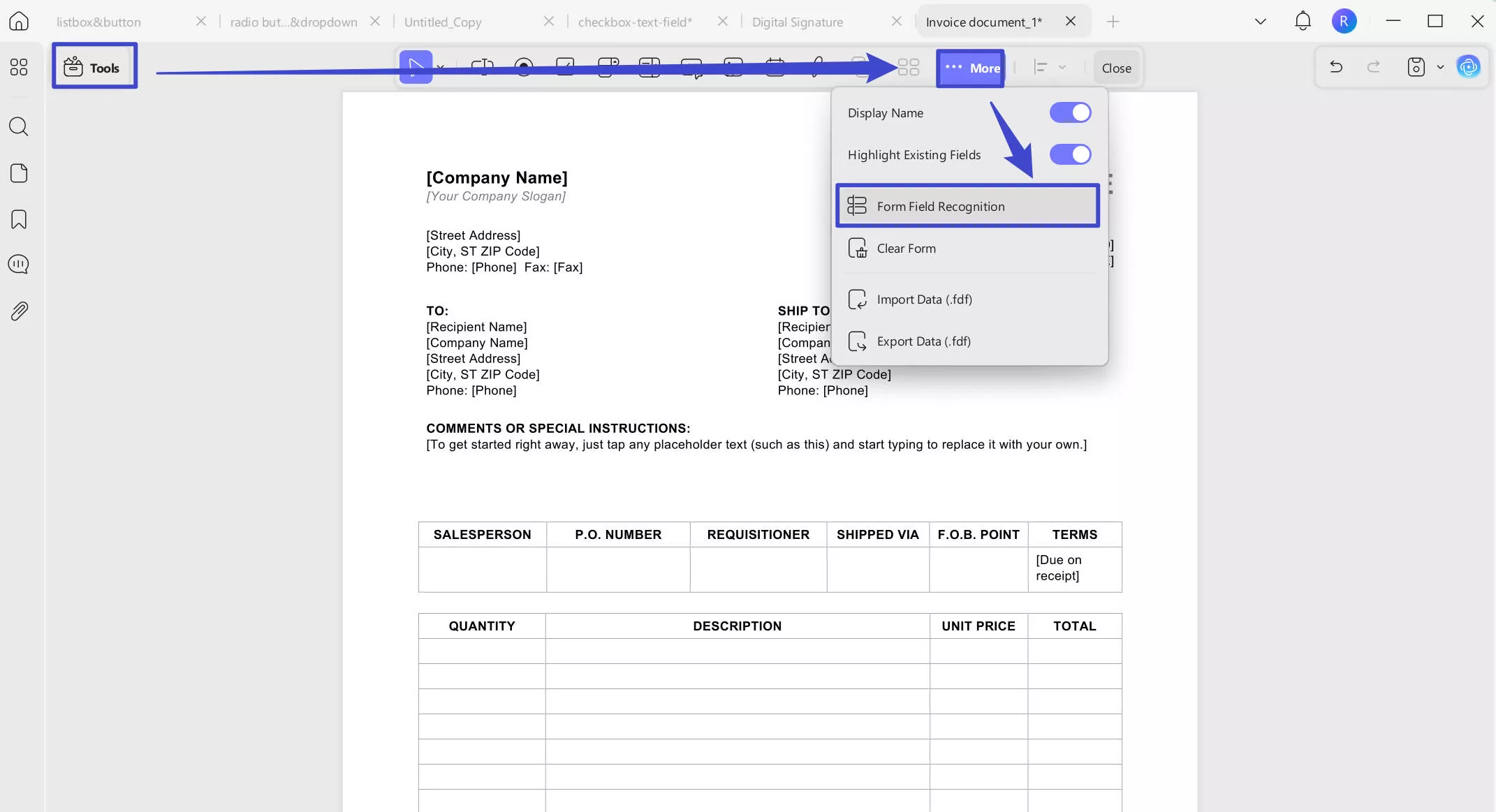
UPDF allows you to manage non-fillable PDF forms by converting them into a fillable format in a single click using the Form Field Recognition option.
Step 1. As you open the PDF form across your Windows application, click on the Form section from the Tools icon at the top left. From the toolbar at the top, access the menu for ...More and choose the Form Field Recognition option to convert your non-fillable form into a fillable PDF.
Step 2. Save your converted PDF form from the Save icon in the top right corner of your screen.
3. Form List Feature
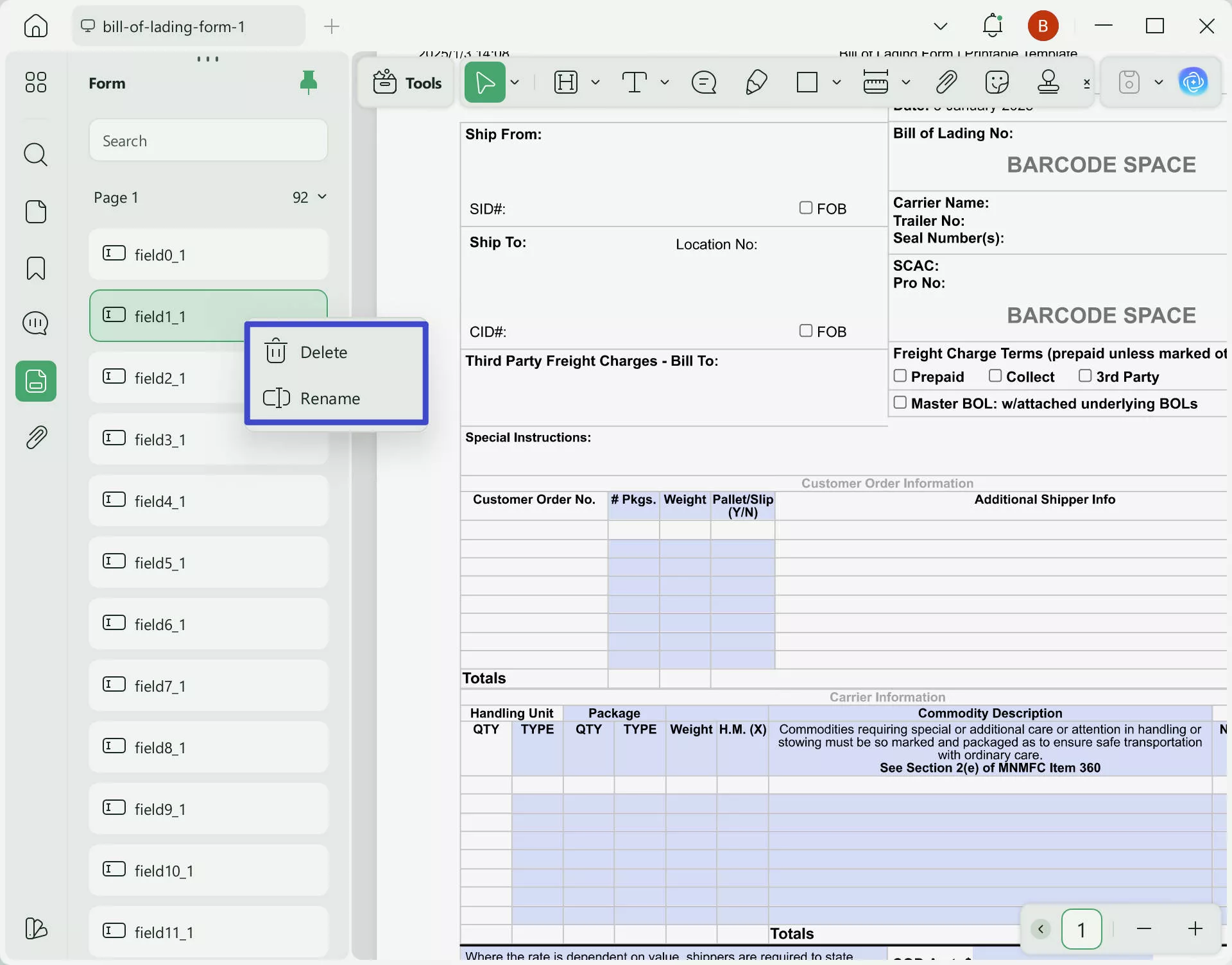
Once you finish creating PDF forms, you may need to manage them—such as deleting fields you added unintentionally or renaming them. In these cases, UPDF’s Form List feature helps you quickly delete or rename form fields. Follow the steps below:
Step1. Open the PDF form whose fields you want to manage.
Step 2. Go to the Forms tab in the left panel. A list of form fields will appear.
Step 3. Right-click a field from the list. In the menu, you can delete or rename it. You can also search for a specific field by entering its name in the search box.
4. Fill PDF Forms
Once you've created a PDF form using UPDF, you or other individuals can fill it out as well. Provided next are some points you need to keep in mind when filling PDF forms using UPDF:
- The form can be filled out after closing the Form Menu in UPDF.
- For text fields, you will have to add the required text to the form. If you are dealing with checkboxes and radio buttons, you will have to tap on the right option provided. Furthermore, you can also select from the dropdown and list boxes according to your desired choice.
- After completing all form filling, save the form or create a new document to make copies of your PDF forms.
5. Some Essential Tips to Follow When Creating and Filling PDF Forms
Watch the video about Automatic Creation Duplicate Across Pages:
There are several other advanced functions that can be used when creating or filling out UPDF forms. Look ahead to discover these essential tips to streamline your PDF creation process:
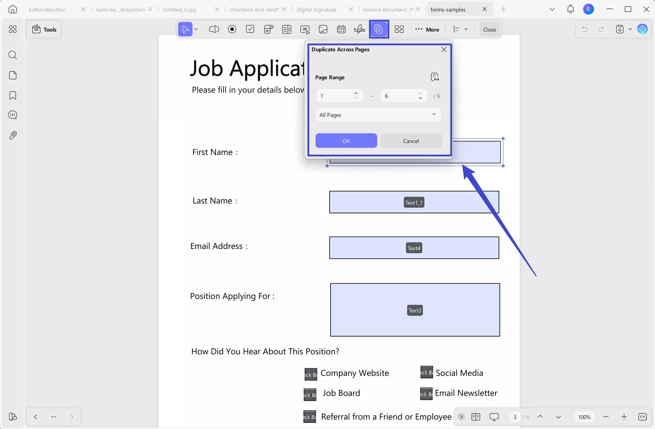
Duplicate Across Pages
To duplicate a particular form field on a page across other pages of the PDF form, select and use the Duplicate Across Pages option. When this function appears, you can define the page range for duplicating the field and click OK to successfully execute the process.
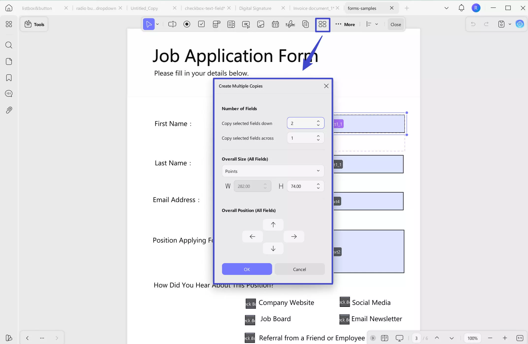
Create Multiple Form Copies
This process can be executed by accessing the Create Multiple Copies option from the top toolbar after selecting a particular form field, such as a dropdown or checkbox, that is added to the form. In the properties window that appears, define the number of fields, overall size, and position to press OK in the end.
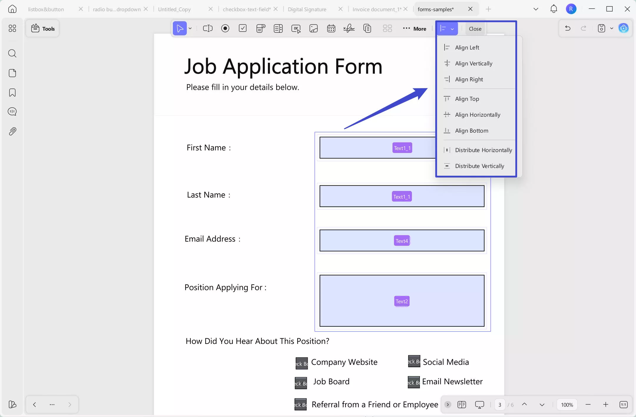
Align Fields
UPDF provides the option of aligning the forms and elements within your PDF form under 8 different alignment options. After selecting the respective fields, move toward the Align button on the top toolbar and select the appropriate option.
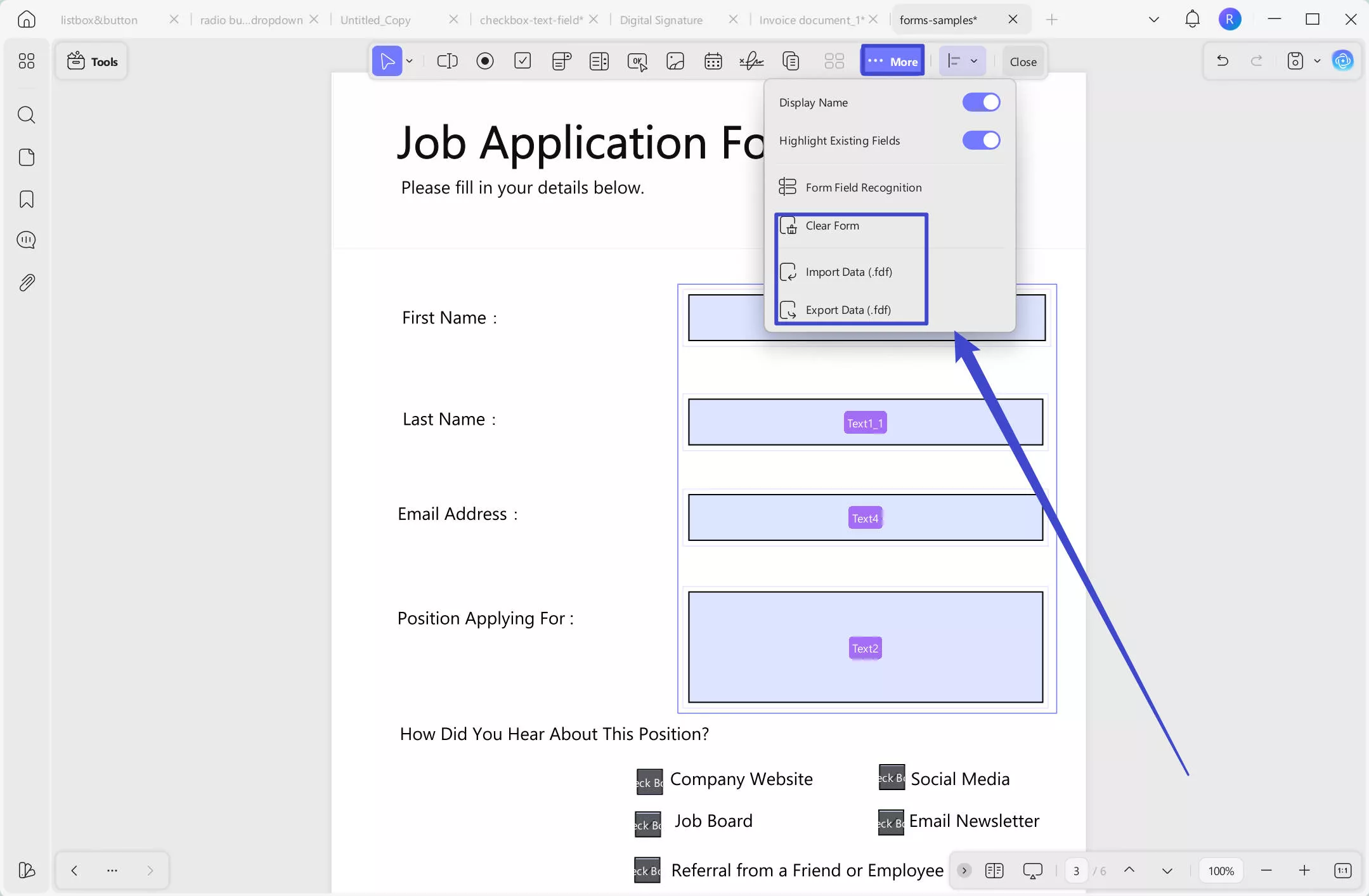
Clear Form
To clear all the elements and details added within the form, you can use the Clear Form option from the …More icon at the top toolbar.
Import and Export Data
To add or export the data into the PDF form, you can simply use the Import Data or Export Data option in the …More icon drop-down menu.
Watch the video below to learn Create Multiple Copies、 Align Fields、 Clear Form and Import and Export Data: