 UPDF
UPDF
 UPDF for Windows
 UPDF for Mac
 UPDF for iPhone/iPad
 UPDF for Android
 Nomostar
 UPDF AI Online
 UPDF Sign
 IvyCraft
 Edit PDF
 Annotate PDF
 Create PDF
 PDF Form
 Edit links
 Convert PDF
 OCR
OCR PDF to Word
 PDF to Image
 PDF to Excel
 Organize PDF
 Merge PDF
 Split PDF
 Crop PDF
 Rotate PDF
 Protect PDF
 Sign PDF
 Redact PDF
 Sanitize PDF
 Remove Security
 Read PDF
 UPDF Cloud
 Compress PDF
 Print PDF
 Batch Process
 About UPDF AI
 UPDF AI Solutions
 AI User Guide
 FAQ about UPDF AI
 Summarize PDF
 Translate PDF
 Chat with PDF
 Chat with AI
 Chat with image
 PDF to Mind Map
 Explain PDF
 PDF AI Tools
 Image AI Tools
 AI Chat Tools
 AI Writing Tools
 AI Study Tools
 AI Working Tools
 Other AI Tools
 AI Bookmark Generation
 AI Bookmark Summary
 AI Watermark Generation
 AI Background Generation
 AI Sticker Generation
 AI Stamp Generation
 AI Editing Suite
 UPDF Copilot
 AI Page Management
 AI Semantic Search
 PDF to Word
 PDF to Excel
 PDF to PowerPoint
 Enterprise Solution
 Enterprise Sign
 Enterprise AI
 Enterprise Plan
 Enterprise User Guide
 Enterprise Webinar
 Banking
 Healthcare
 Insurance
 Legal
Legal Manufacturing
 Government
 Researchers & PhDs
 Solopreneurs & Freelancers
 Lawyers & Legal Professionals
 Real Estate Agents & Brokers
 Education Solution
 Customer Stories
 User Guide
 UPDF Tricks
 FAQs
FAQs UPDF Reviews
 Download Center
 Blog
Blog Newsroom
 Tech Spec
 Updates
 UPDF vs. Adobe Acrobat
 UPDF vs. Foxit
 UPDF vs. PDF Expert

Most "how to edit a PDF" advice stops at the moment the new text appears on screen. But anyone who edits PDFs for real knows the hard part comes next: you change one number, and the font quietly switches to Helvetica, or the line you lengthened shoves the next line off the page. So instead of asking can these tools edit text — they all can — I asked the question that actually decides whether the file is usable: after you edit the words, does the document still look like the original?
I ran the three PDF editors people most often weigh against each other — UPDF, Adobe Acrobat, and the free PDFgear — through the same seven edits on seven real PDFs, then scored each result on whether the font and the layout held. The short version: on simple same-length swaps all three are fine. The differences only appear under pressure — longer replacement text, a brand font that is not installed, a two-column page, a table cell — and that is exactly where the file either stays intact or falls apart.
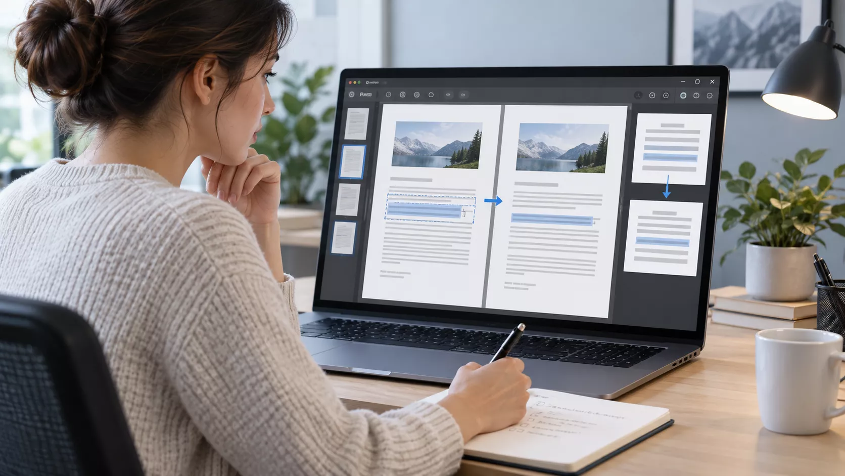
Part 1. What most comparisons miss: "edited correctly" is not "still looks right"
Nearly every PDF-editing walkthrough judges success by one thing: did the new text go in? That is the wrong test. Typing the right characters is easy. Keeping the font family, size, weight, colour, line breaks, spacing, and neighbouring content exactly as they were — that is the part that breaks, and it is the part a reader notices.
So we scored two different things and kept them apart: whether the text was correct, and whether the appearance survived. A PDF where the number is right but the font became Helvetica, or where the sentence is right but it now overlaps the line below, is not a successful edit — it is a document you have to fix by hand or, worse, one that ships looking wrong. That distinction is the lens for the whole article.
Part 2. How we tested (so you can judge the results)
Everything below comes from one controlled run. It is a single-reviewer evaluation scored against annotated before/after screenshots, not an independently replicated benchmark — we say that plainly so you can weight it accordingly.
| Test dimension | What we did |
|---|---|
| Tools & versions | UPDF (desktop v2.5.7), Adobe Acrobat (v2026.002.21901), and PDFgear (v2.27), all current individual builds |
| Test date | September 2026 |
| Test machine | MacBook Air 13-inch (M4, 2025), Apple M4, 16 GB RAM, macOS Tahoe 26.2 — all three tools run on the same Mac desktop client |
| Documents | 7 real PDFs, each chosen for a specific layout structure — single-column text, a KPI table, a two-column academic page, a brand heading, a bulleted list, and a scanned page |
| Edit per file | One frozen text change per file, entered in each tool's "edit existing text" mode, with no manual font or spacing adjustment allowed on the first pass |
| Total outcomes | 21 (7 files × 3 tools). E1–E6 form the six-file digital-text leaderboard; E7 (scanned/OCR) is reported separately |
| Scoring | 100 points per task — Text 10 / Font 40 / Layout 40 / Save stability 10 — judged after saving and reopening the file |
Why font and layout carry 40 points each. Getting the text right is table stakes (10 points). The reason you use "edit existing text" instead of retyping the whole page is to keep the look, so the two things that measure "did the look survive" — font and layout — are where the score lives.
The font tolerances. To keep judging consistent, a font "survives" only if the family is unchanged, the size is within 0.25 pt, and weight, colour, and baseline all match. A visible family substitution (e.g. Calibri → Helvetica) is a critical failure — it caps the score regardless of how good everything else looks, because it is the single most common and most damaging PDF-editing defect.
The seven files and the pressure each one applies. This is the heart of the design: each file isolates one way editing can go wrong.
| ID | Document | File & structure | The edit | What it stresses |
|---|---|---|---|---|
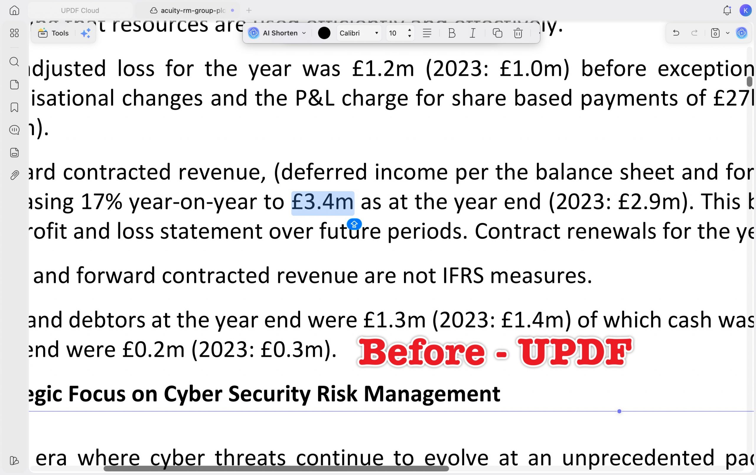
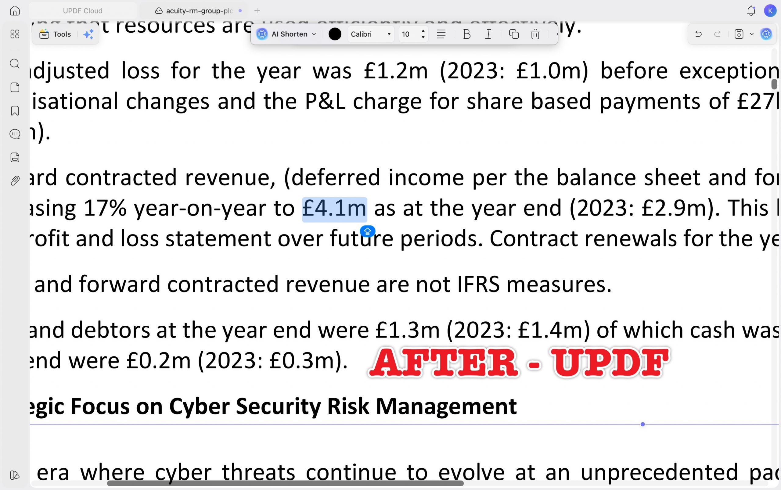
| E1 | Acuity RM Group plc — Annual Report 2024 | Single-column financial text | £3.4m → £4.1m (same length) | Baseline — everyone should pass |
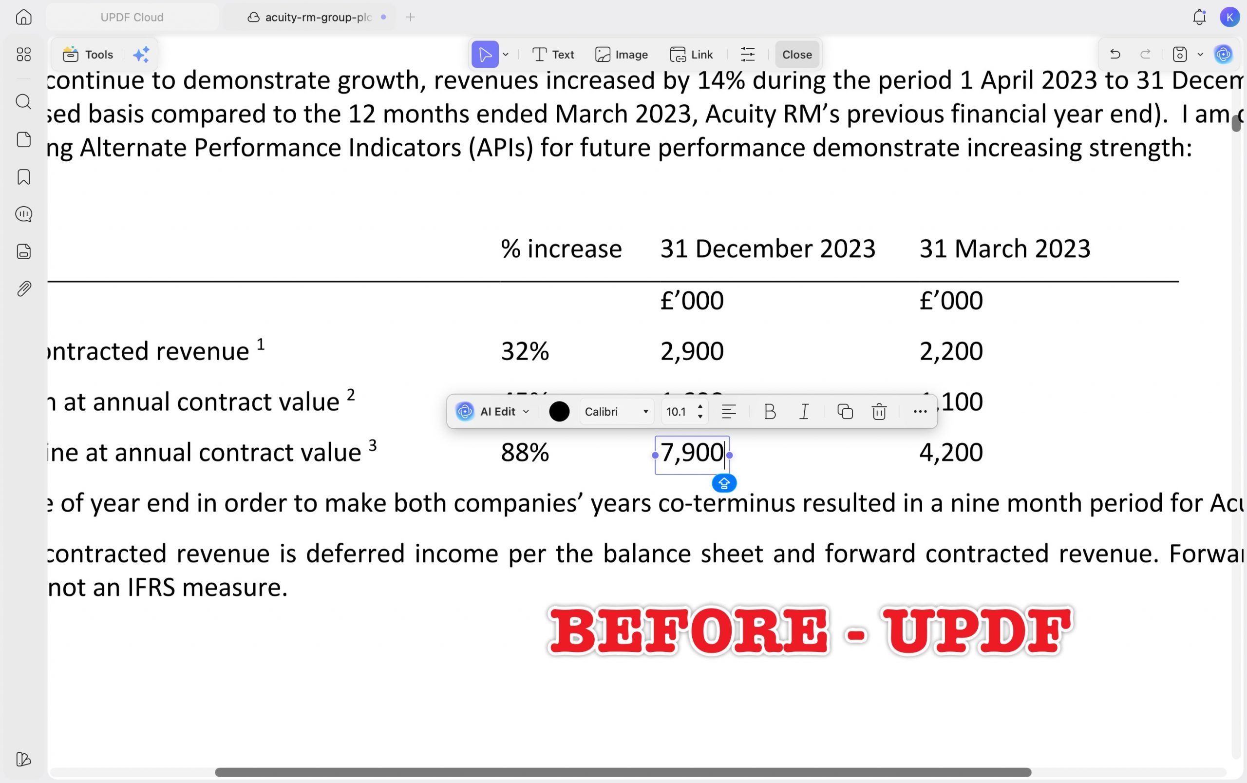
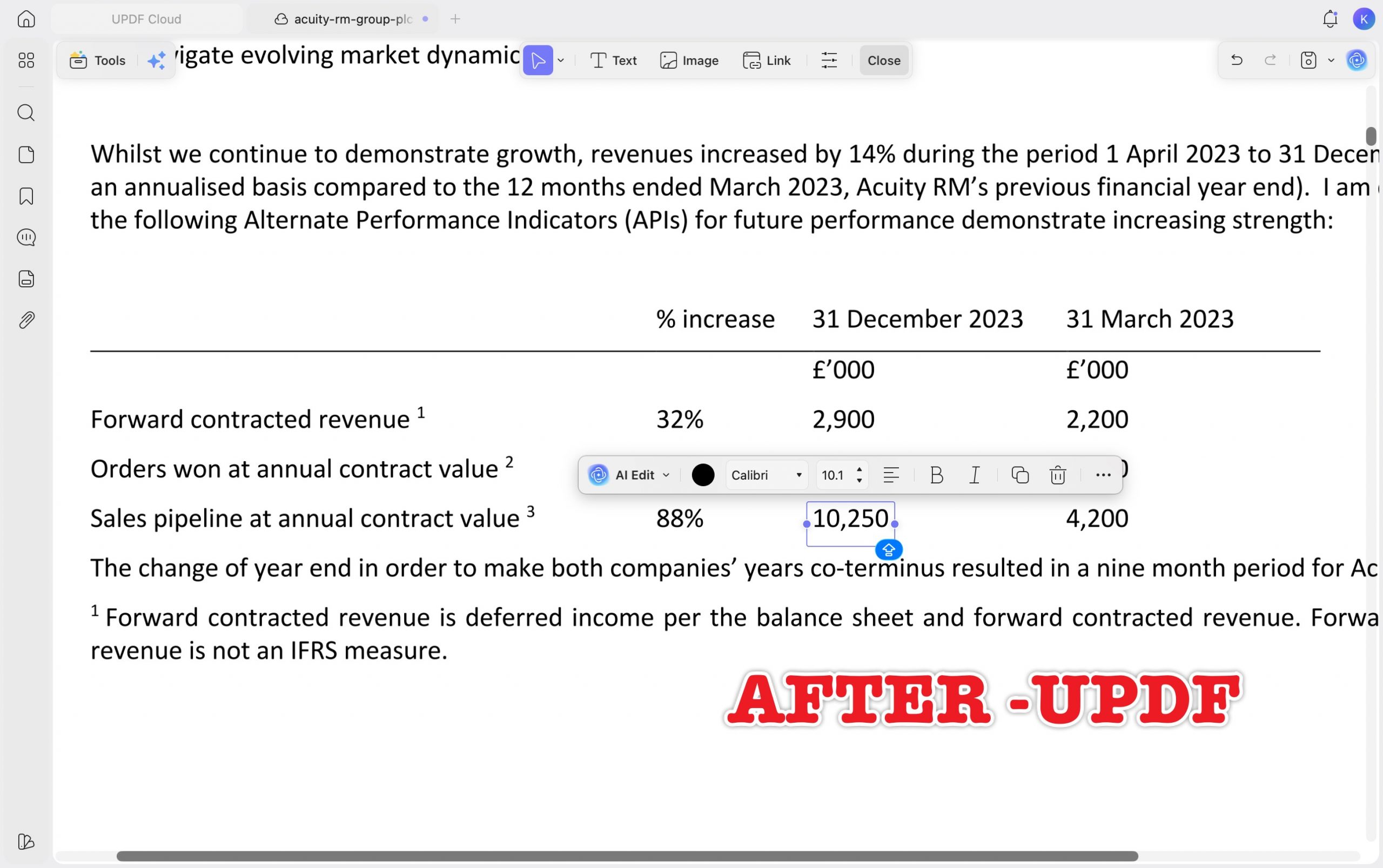
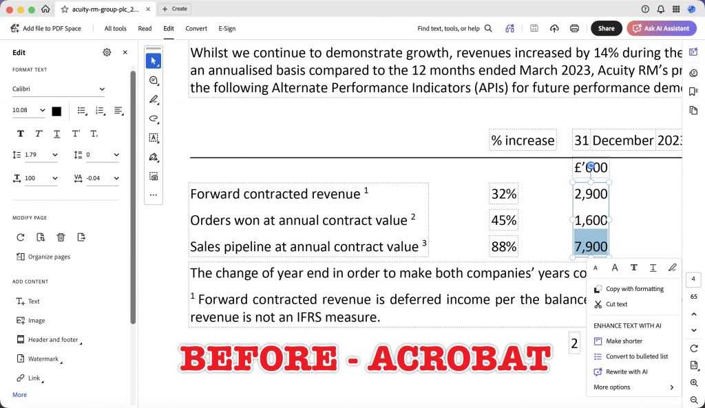
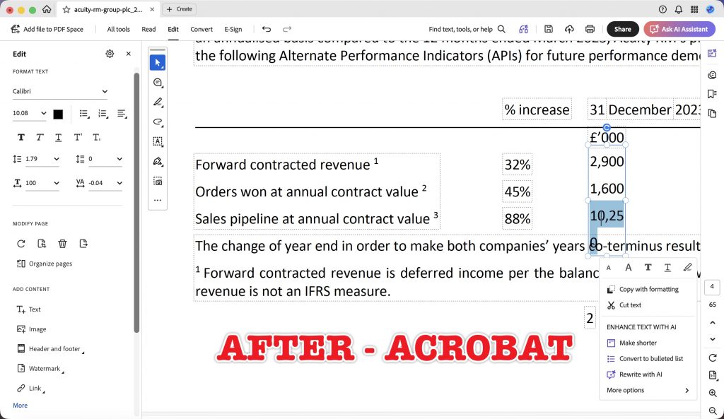
| E2 | Acuity RM Group plc — Annual Report 2023 | KPI table cell | 7,900 → 10,250 (longer number) | Does the longer value break the cell or collide with the next column? |
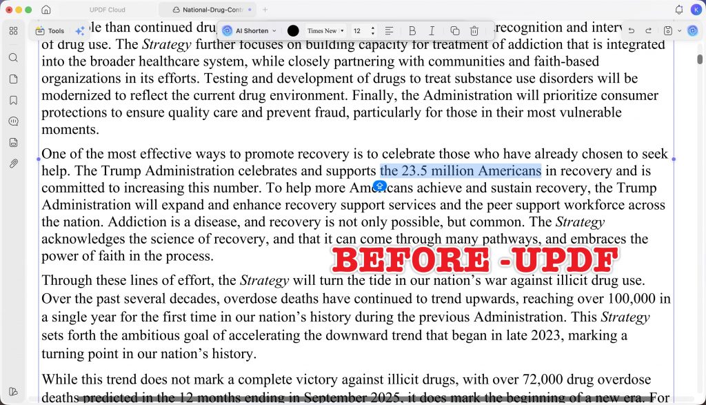
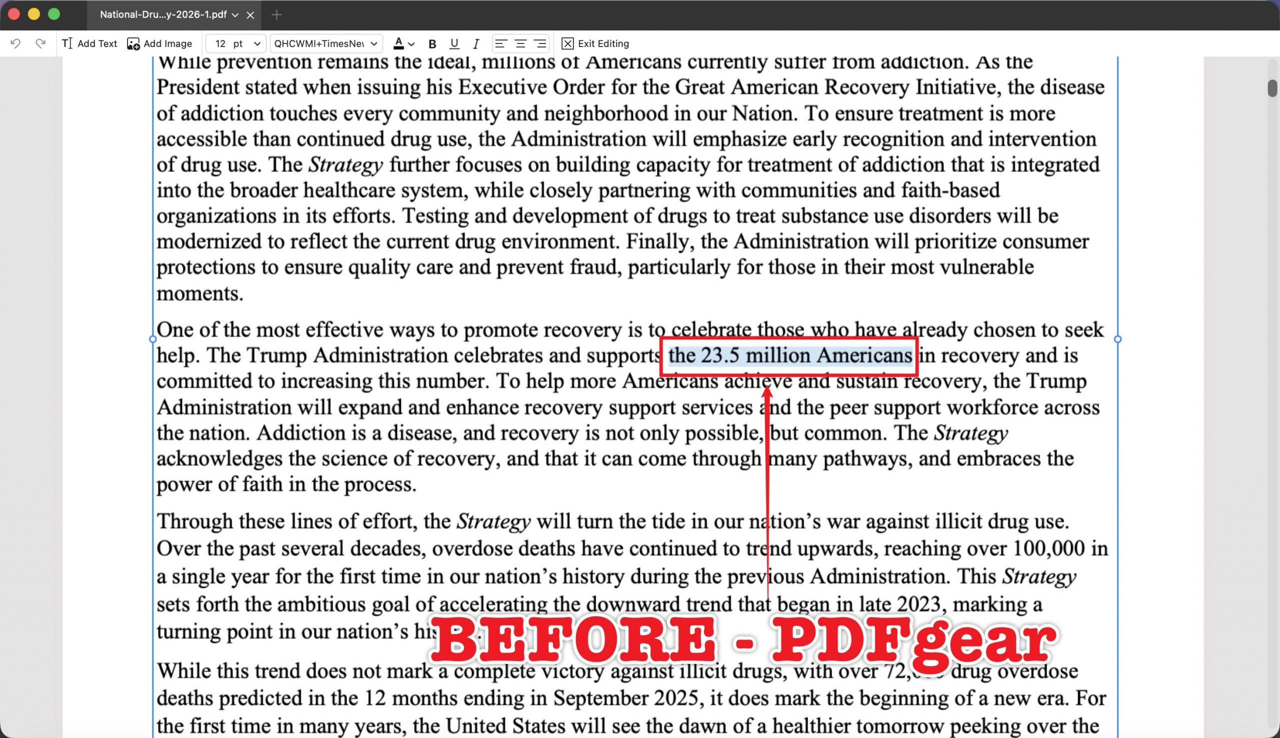
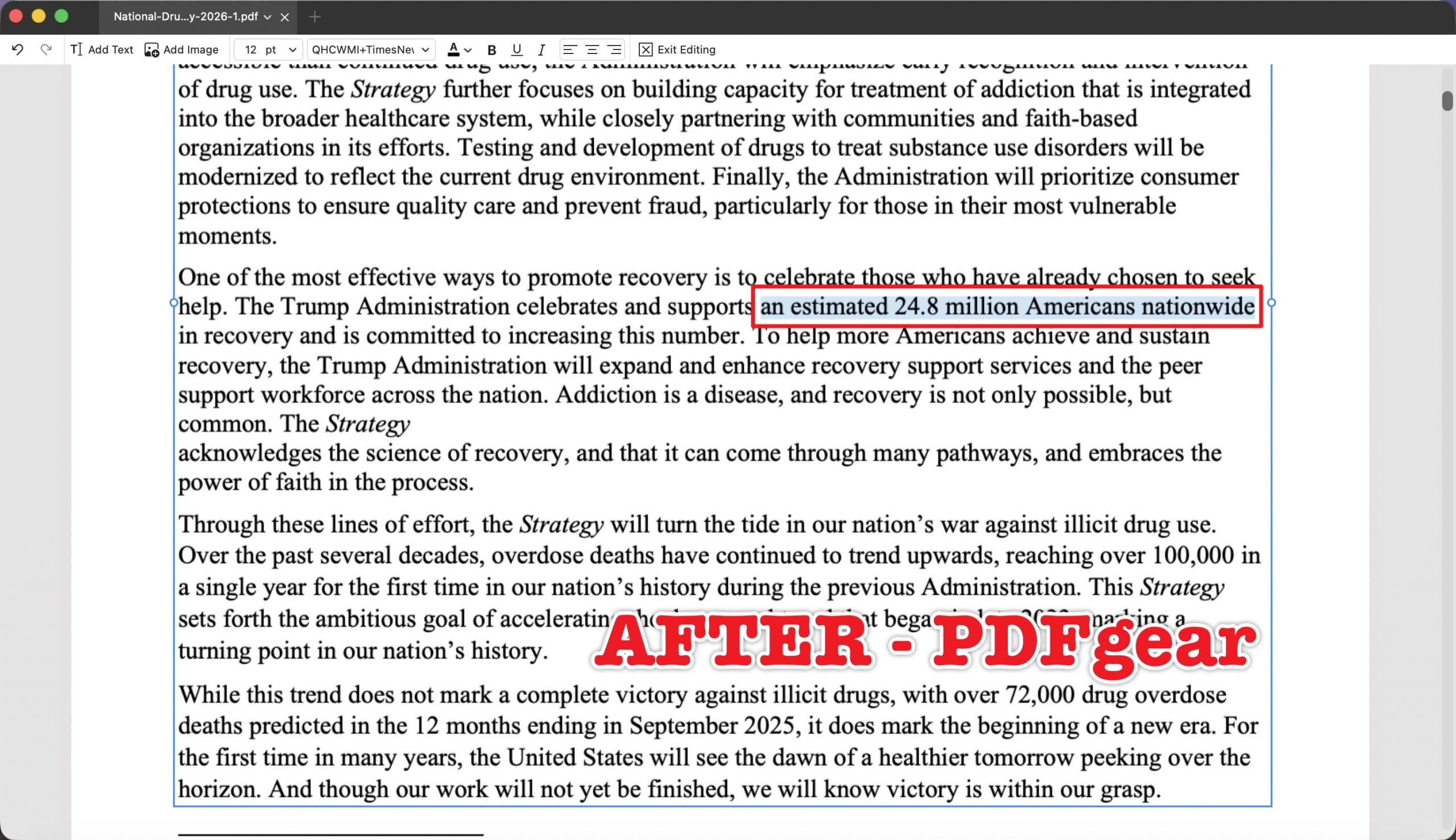
| E3 | National Drug Control Strategy 2026 | Single-column body text | phrase → "an estimated 24.8 million Americans nationwide" | Does the longer sentence reflow cleanly or overflow? |
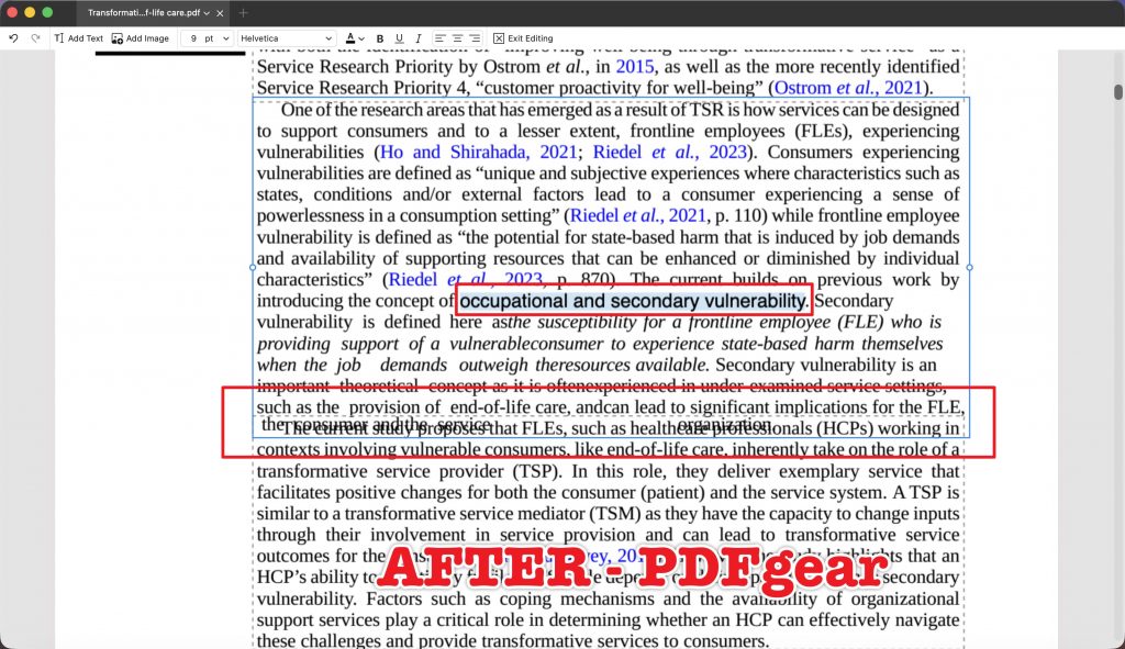
| E4 | Transformative Service in Healthcare: Secondary Vulnerability and Coping Mechanisms in End-of-Life Care | Two-column academic page | "secondary vulnerability" → "occupational and secondary vulnerability" | Does the longer term intrude into the adjacent column? |
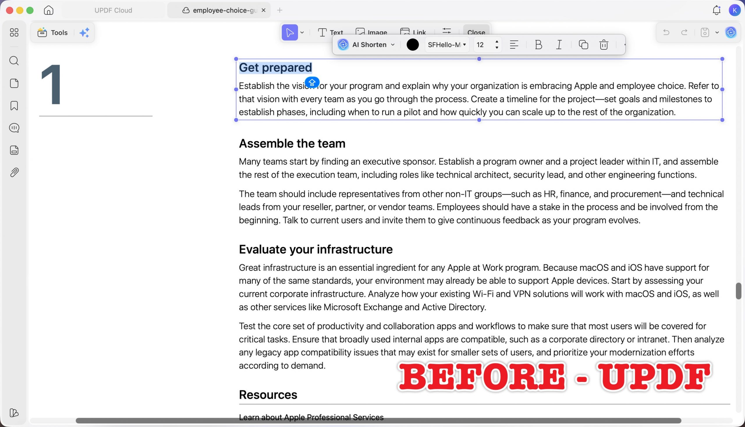
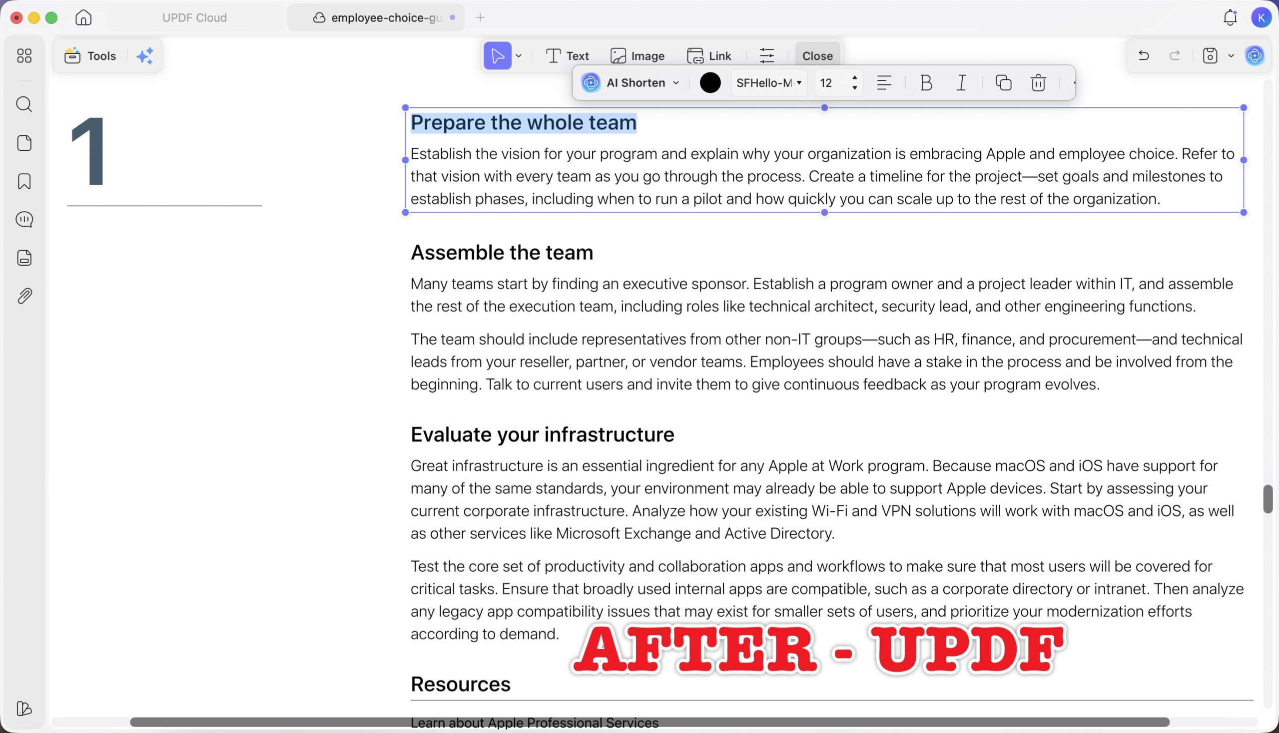
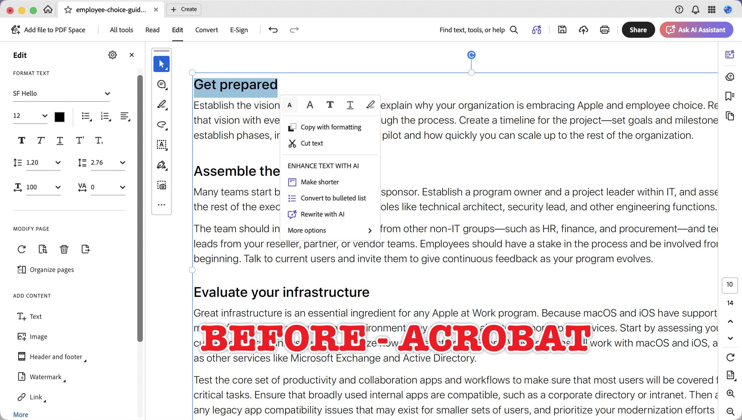
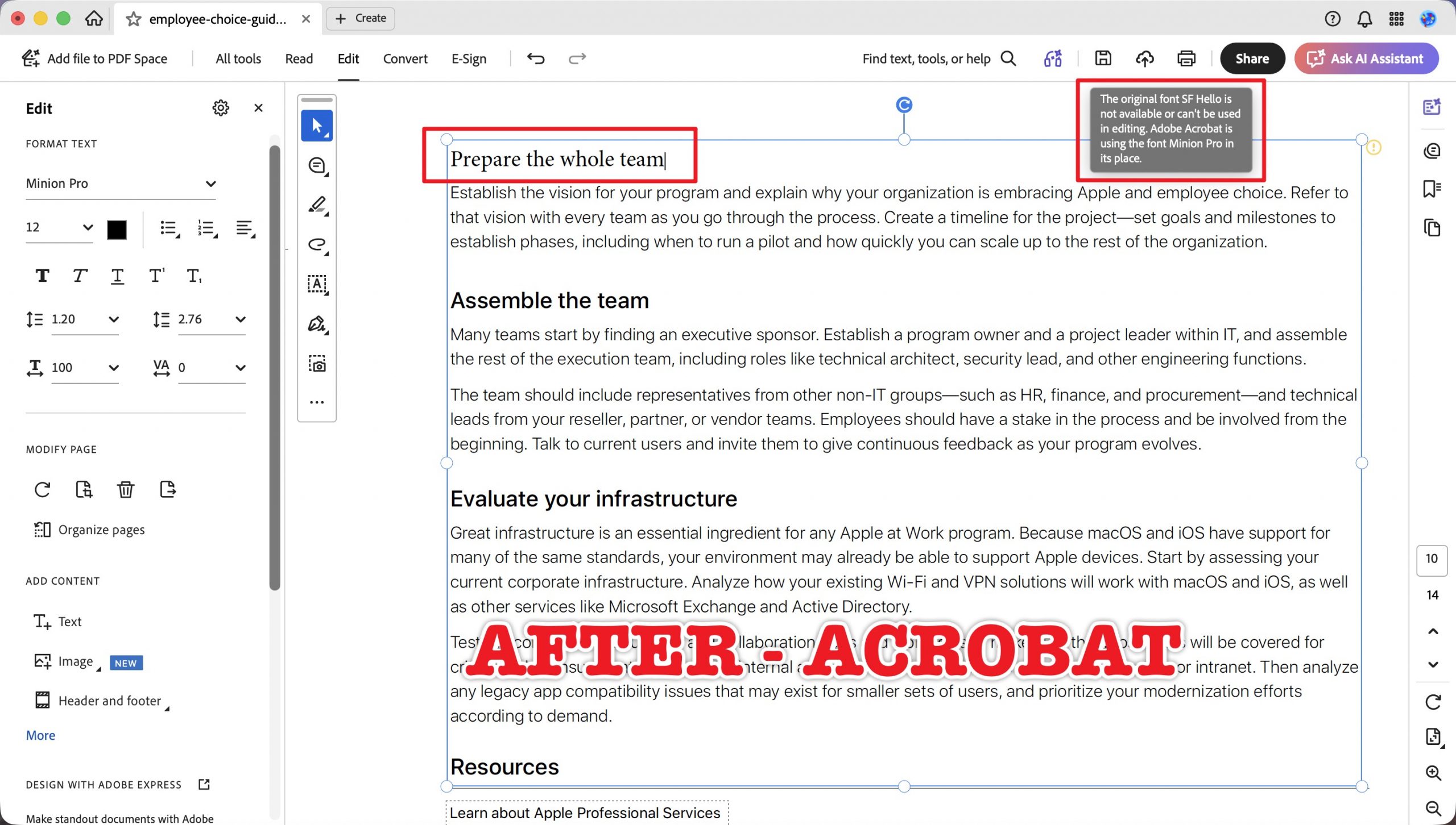
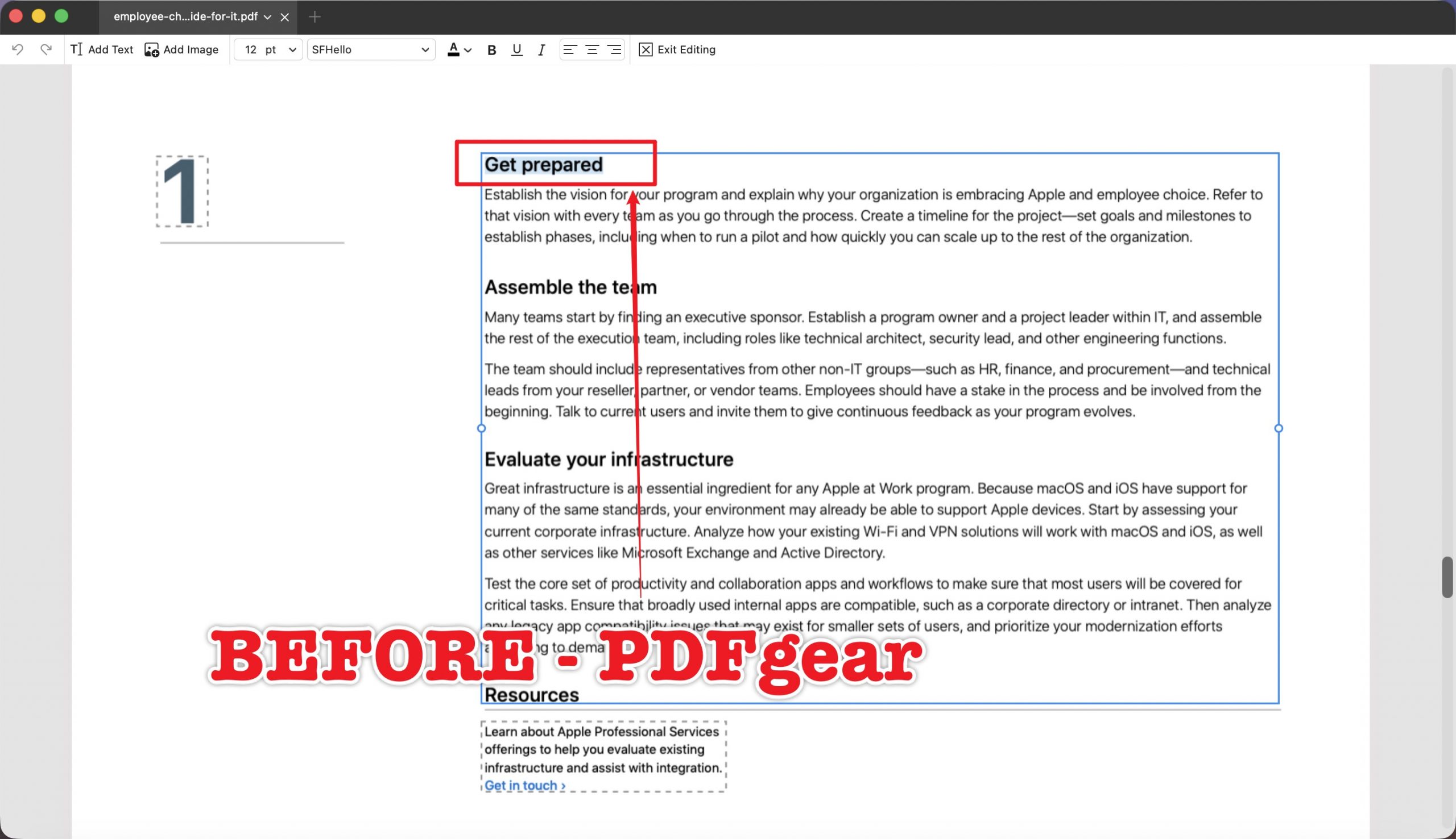
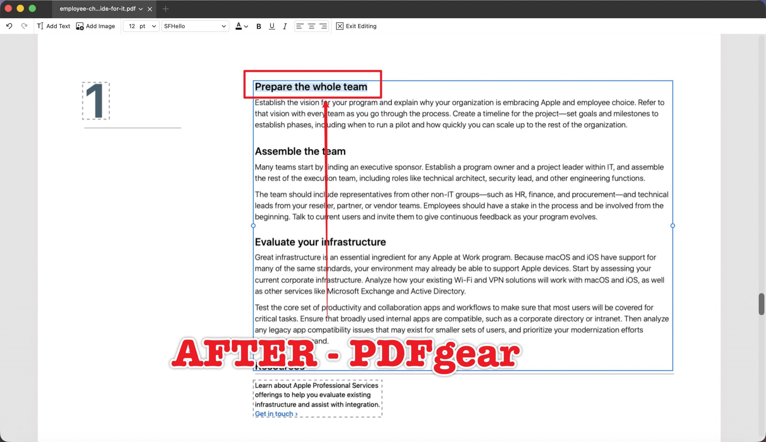
| E5 | Employee Choice Guide for IT | Brand heading, possibly missing font | "Get prepared" → "Prepare the whole team" | Does the tool keep the brand font or silently substitute it? ★core |
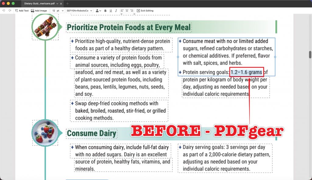
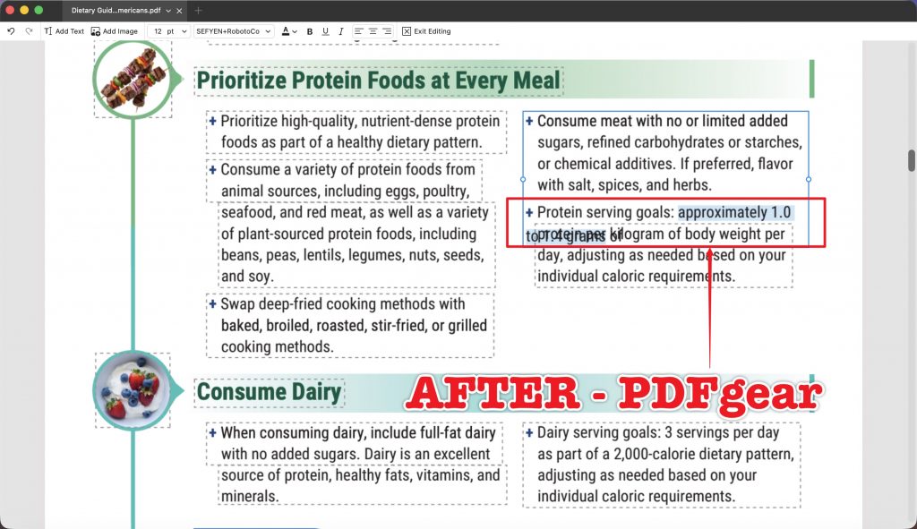
| E6 | Dietary Guidelines for Americans | Bulleted nutrition list | "1.2–1.6 grams" → "approximately 1.0 to 1.4 grams" | Do the bullet indent, spacing, and alignment hold? |
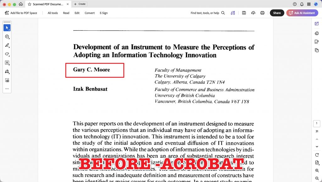
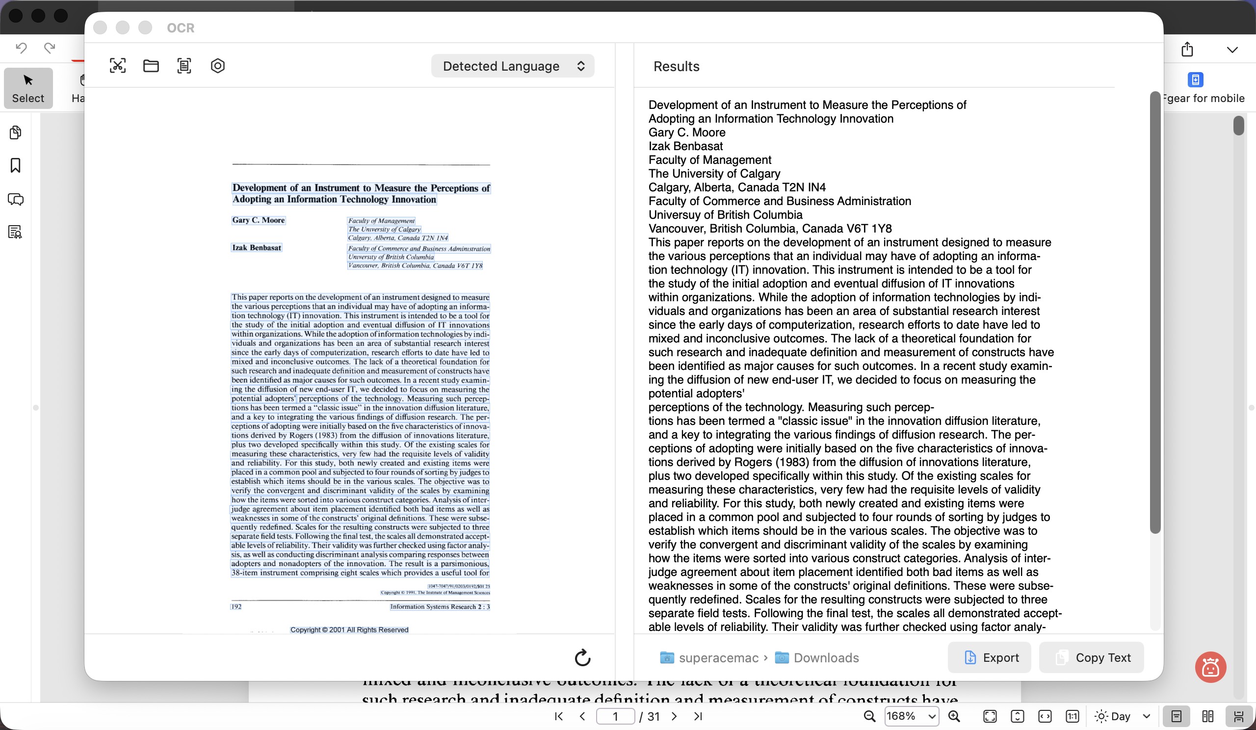
| E7 | Scanned PDF Documents | Scanned page (OCR) | Gary C. Moore → Caroline Moore | Can the tool edit scanned text in place, and does it leave ghosting? (reported separately) |
Two things this design deliberately avoids: no same-length-only edits (those hide every difference), and no manual clean-up on the first pass (we score what the tool does automatically).
The full method, the complete scoring rubric and font tolerances, the per-task procedure, and every tool's score and judgement for all seven files are published in the companion data appendix.
Part 3. The results at a glance
Scores are the six-file digital-text leaderboard (E1–E6). E7, the scanned-PDF task, is listed on its own so OCR ability does not distort ordinary editing results.
| Metric | UPDF | Adobe Acrobat | PDFgear |
|---|---|---|---|
| Main score (E1–E6) | 96.7 | 92.5 | 77.7 |
| First-pass rate (≥90, no critical failure) | 6/6 (100%) | 4/6 (66.7%) | 2/6 (33.3%) |
| Font fully preserved | 6/6 (100%) | 5/6 (83.3%) | 3/6 (50%) |
| Layout fully preserved | 4/6 (66.7%) | 3/6 (50%) | 2/6 (33.3%) |
| E7 scanned/OCR edit | 92 (pass) | 100 (pass) | 0 (fail) |
Read honestly, it is not a clean sweep — it is a clear pattern with real trade-offs:
- UPDF held the font in every single file and passed all six digital-text edits on the first try. Its weaker number is layout-perfect (4/6): on two files the longer text reflowed and added a line — clean and readable, but not pixel-identical to the original.
Windows • macOS • iOS • Android 100% secure
- Adobe Acrobat was strong but stumbled twice, and both stumbles matter: a number that wrapped inside a table cell (E2) and a brand font it could not keep (E5). On the scanned file, though, Acrobat was the best of the three.
- PDFgear is free, and it shows under pressure. It typed the right text in most cases, but substituted Helvetica repeatedly and produced overlapping, unreadable lines on the harder layouts. It also cannot edit scanned text in place at all.
The individual cases below are more useful than the averages — especially the two where Acrobat, not UPDF, reveals the failure everyone should worry about.
Part 4. Which tool fits which editing job
| If you mainly edit… | Your first worry is… | Lean toward |
|---|---|---|
| Contracts, reports, letterhead | The font must not change | UPDF — kept the font in all 6 files |
| Financial tables / KPI cells | A longer number must not break the cell | UPDF — only tool that kept E2 on one line |
| Branded material with custom fonts | The heading font must survive | UPDF or PDFgear — Acrobat substituted the brand font |
| Scanned / photographed documents | You must edit the scanned text itself | Adobe Acrobat — best scanned-PDF result; PDFgear cannot do it |
| Occasional edits on a zero budget | Free, and good enough for simple swaps | PDFgear — fine for same-length text, risky on anything longer |
| You already pay for Adobe | Fewest tools | Adobe Acrobat, with the two caveats above |
Part 5. UPDF — the one that kept the font every time
Best for:
- contracts, financial tables, branded documents, and any file where the original font and layout must survive an edit.
Skip if:
- your main job is editing scanned pages — UPDF passed, but Acrobat was slightly cleaner there.
Across all six digital-text files, UPDF's defining trait was that the font never moved. Three cases show why that matters.
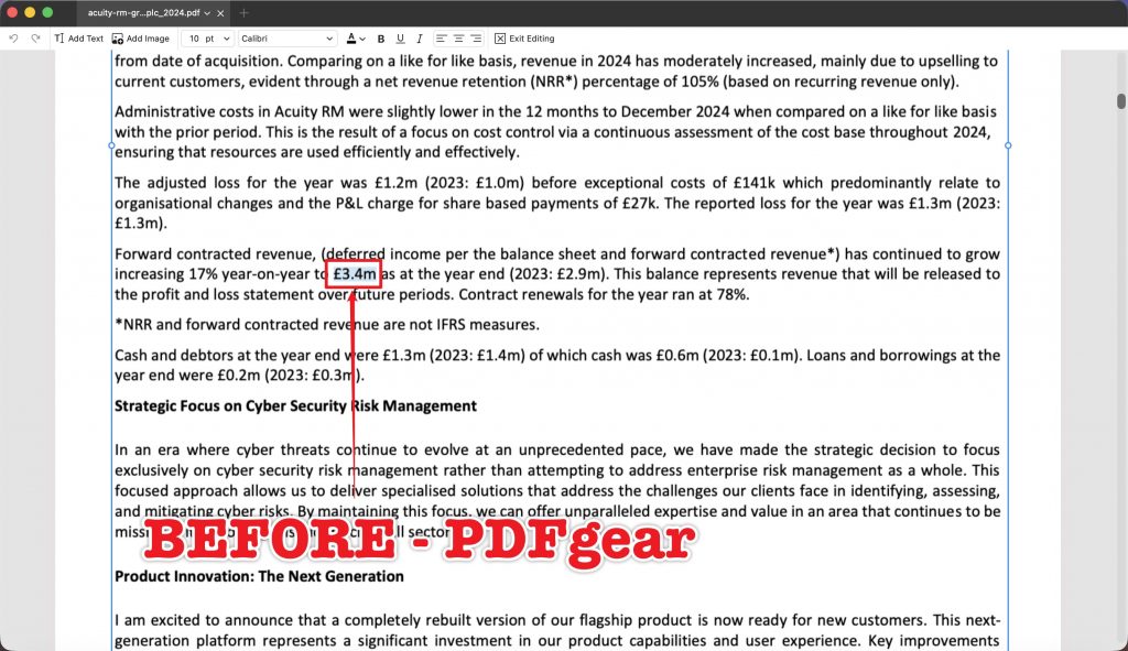
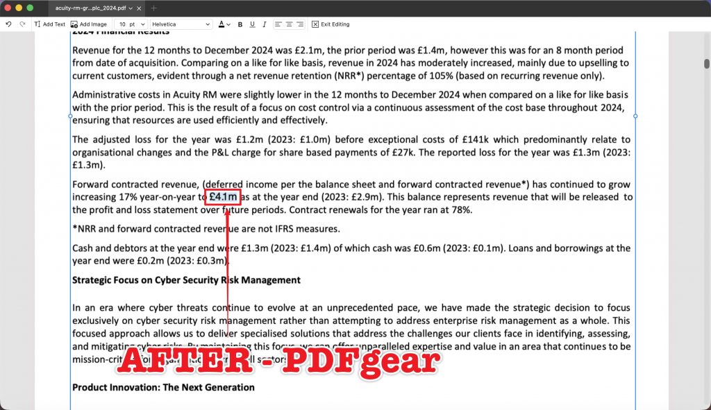
On E1 (single-column financial text), the same-length swap £3.4m → £4.1m is the baseline everyone should pass — and UPDF did, keeping Calibri at 10 pt with the line in its original position.
On E2 (KPI table cell), the edit gets harder: 7,900 → 10,250 is a longer number inside a narrow cell. UPDF was the only tool that kept the value on one line inside the cell, preserving Calibri 10.1 pt while the neighbouring 4,200 value, row labels, and footnote all stayed separated. This is the case that separated the three tools most clearly.
On E5 (brand heading with a possibly-missing font) — the core test — UPDF replaced "Get prepared" with the longer "Prepare the whole team", kept the SF Hello brand font at 12 pt, and fit the longer title on one line without pushing the body copy below it. This is precisely where Acrobat failed (see Part 6), which makes it UPDF's most important win.
Hit the button below to get UPDF free and give it a try.
Windows • macOS • iOS • Android 100% secure
The honest limitation. UPDF's weaker score is layout perfection, not font. On E3 (body text) and E6 (bulleted list), the longer replacement text reflowed cleanly and added a line — readable and contained, with indentation and the following section intact, but not pixel-identical to the original single-line layout.
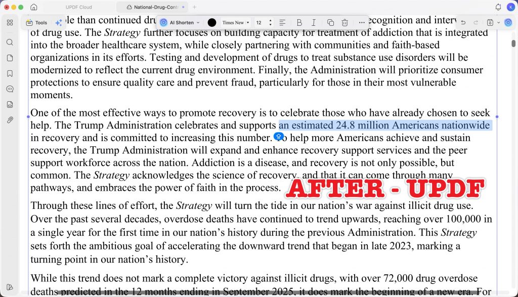
It scored 90 on both (a pass), not 100. If your requirement is that the text after your edit must never shift to a new line at all, no tool fully avoided that when the text genuinely got longer — but UPDF's reflow was the most contained.
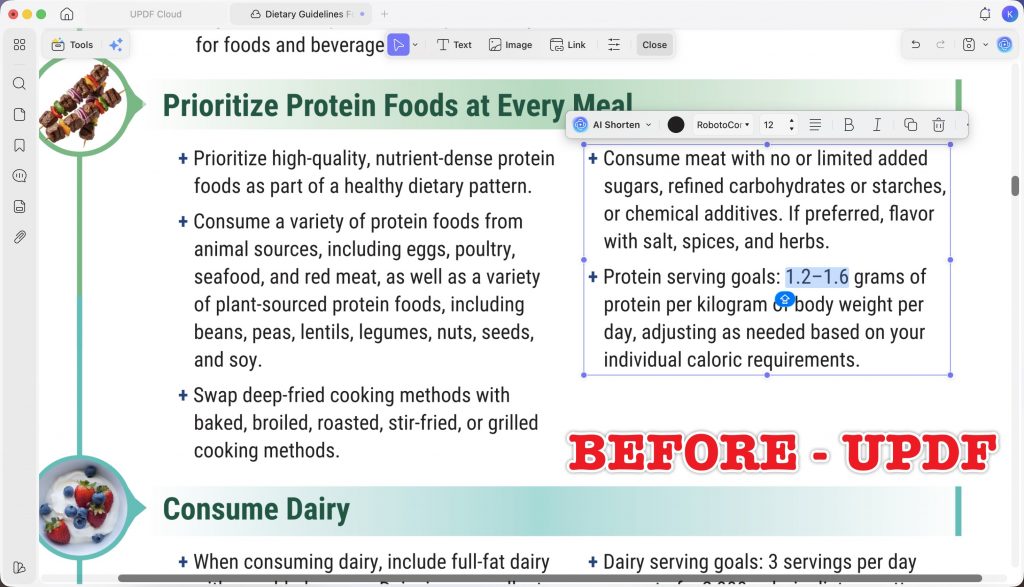
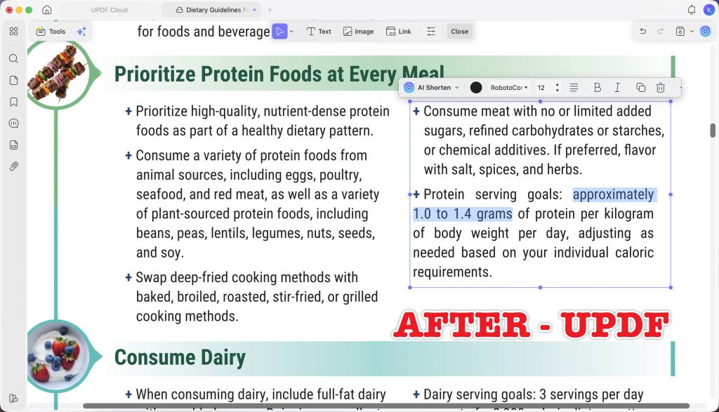
If you want the step-by-step for this, our guide on how to edit a PDF while keeping the same font walks through the exact settings; this test is the evidence for how well it holds up in practice. You can also see the full feature set on the How to Edit a PDF page or watch the video tutorial below.
Part 6. Adobe Acrobat — strong, but it revealed the scariest failure
Best for:
- editing scanned documents, and teams already standardized on Adobe.
Skip if:
- you edit branded material with custom fonts, or you frequently edit tight table cells.
Adobe Acrobat earned its passes honestly, and on several files it was indistinguishable from UPDF — so it is worth being specific about the two places it broke, because both are the kind of failure you would not catch until the file is already sent.
On E5 (brand heading), Acrobat typed the new heading correctly and kept the surrounding layout intact — but it reported that the brand font (SF Hello) was unavailable for editing and substituted Minion Pro at the same size. The layout was fine; the font was visibly wrong. Under the test's rules this is a critical failure, and it is the exact scenario the guide on keeping the same font when editing a PDF is written to prevent.
On E2 (KPI table cell), Acrobat kept the font (Calibri) correctly, but the lengthened number wrapped onto a second line inside the narrow value box — an abnormal new line that, in a financial table, quietly changes how the figure reads.
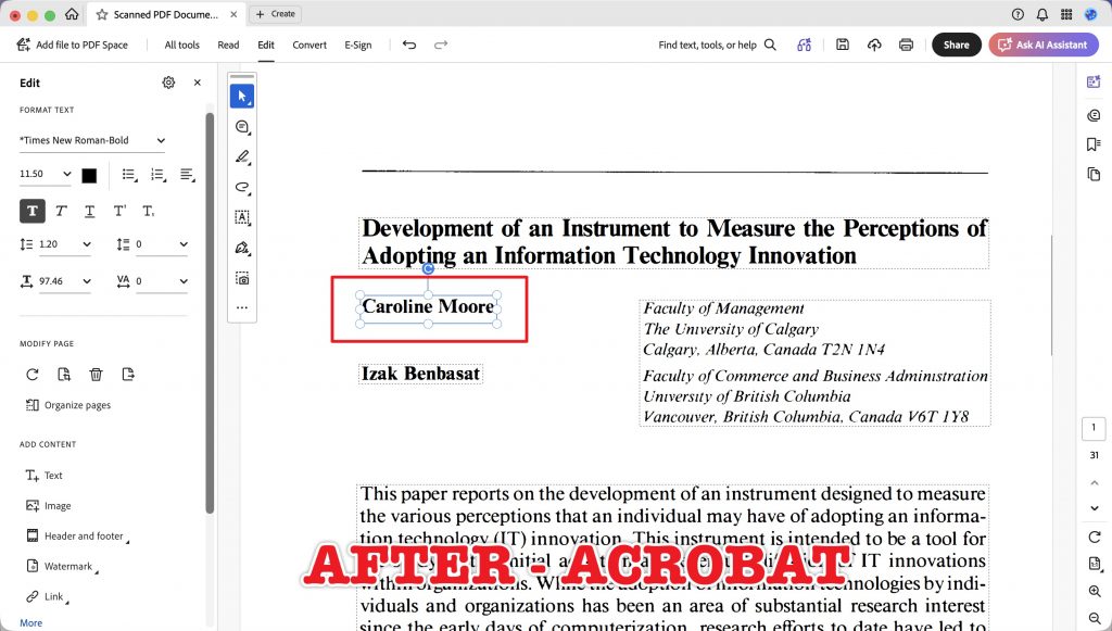
Where Acrobat clearly led was the scanned file (E7): it identified and kept Times New Roman Bold at 11.5 pt, removed the original scanned name cleanly with no visible ghosting, and produced the best result of the three. If scanned-document editing is your main use, that is a genuine point in Acrobat's favour.
Part 7. PDFgear — free, and honest about why free has limits
Best for:
- occasional, same-length text fixes when you cannot spend anything.
Skip if:
- your edits make text longer, use custom or brand fonts, or involve scanned pages.
PDFgear is free, and this test is not a hit piece on free software — it is a clear-eyed look at what "free" costs you when the edit gets hard. On the easiest case it was fine; on everything harder it was the least reliable of the three.
Its recurring problem was font substitution: on E1, E2, and E4 it silently replaced the original font with Helvetica — a critical failure even when, as on E1, the text and layout were otherwise correct.
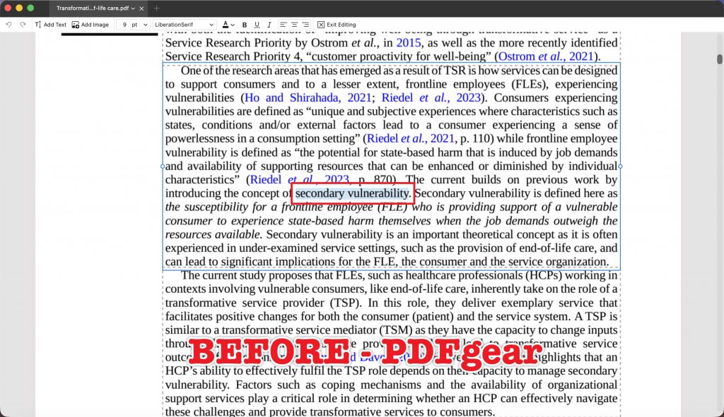
On the harder layouts it also produced overlapping, unreadable lines: on E4 multiple lines below the edit overlapped and duplicated visually, and on E6 (bulleted list) the new lines collided inside the bullet.
It did have real successes: on E5 it kept the SF Hello brand font perfectly (beating Acrobat on that file), and on E3 its reflow was clean.
But on the scanned file (E7) it could not edit the text in place at all — its "Current File OCR" mode only exposes extracted text to export or copy, with no way to edit the scanned page itself, so that task scored zero.
If budget is the only constraint, PDFgear handles simple swaps. But "the text is right" hid a changed font in three of six files here — so for anything you will send or publish, verify the font before you trust it.
Part 8. A different kind of edit: pasting rich text from Word
The seven scored files all test editing text already in the PDF. But there is a second, very common workflow this test uncovered a real difference in: copying formatted text out of Word and pasting it into a PDF. This was a qualitative observation outside the 21-outcome scoring, but it is worth reporting because the three tools behave in genuinely different ways — and because there is no single "right" behaviour, it comes down to which tool gives you the choice.
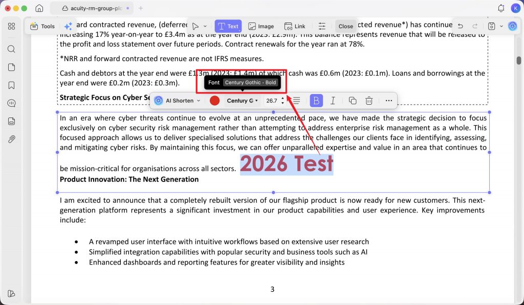
To check it, I styled the words "2026 Test" in Word as Century Gothic, bold, red, then pasted that into a Calibri text block inside the E1 file in each tool.
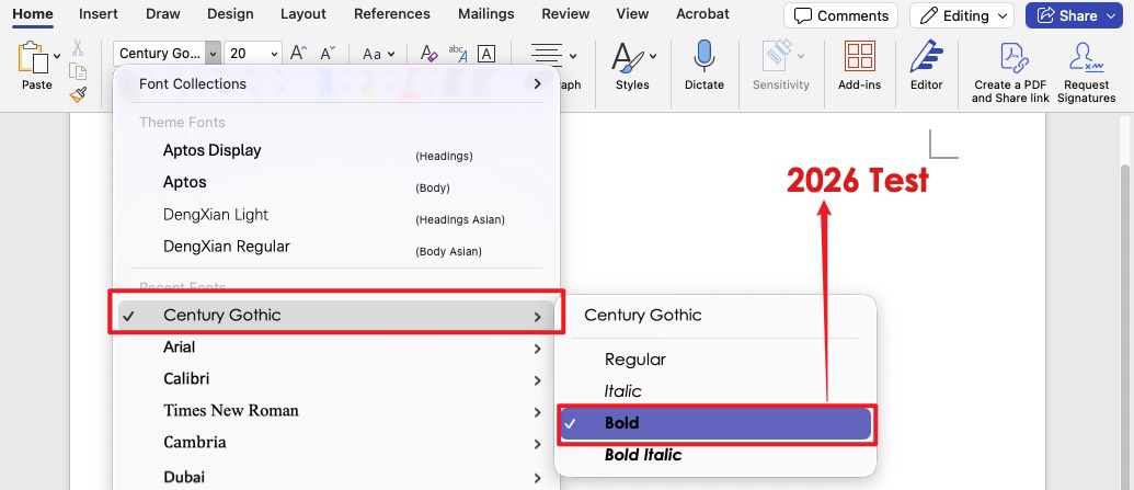
- UPDF kept the source formatting. After pasting, "2026 Test" stayed Century Gothic, bold, and red — the toolbar confirmed Century Gothic · Bold — exactly as it looked in Word.
- Acrobat and PDFgear applied the destination block's style instead. In both, the pasted words dropped the Word styling and took on the surrounding Calibri paragraph's format.
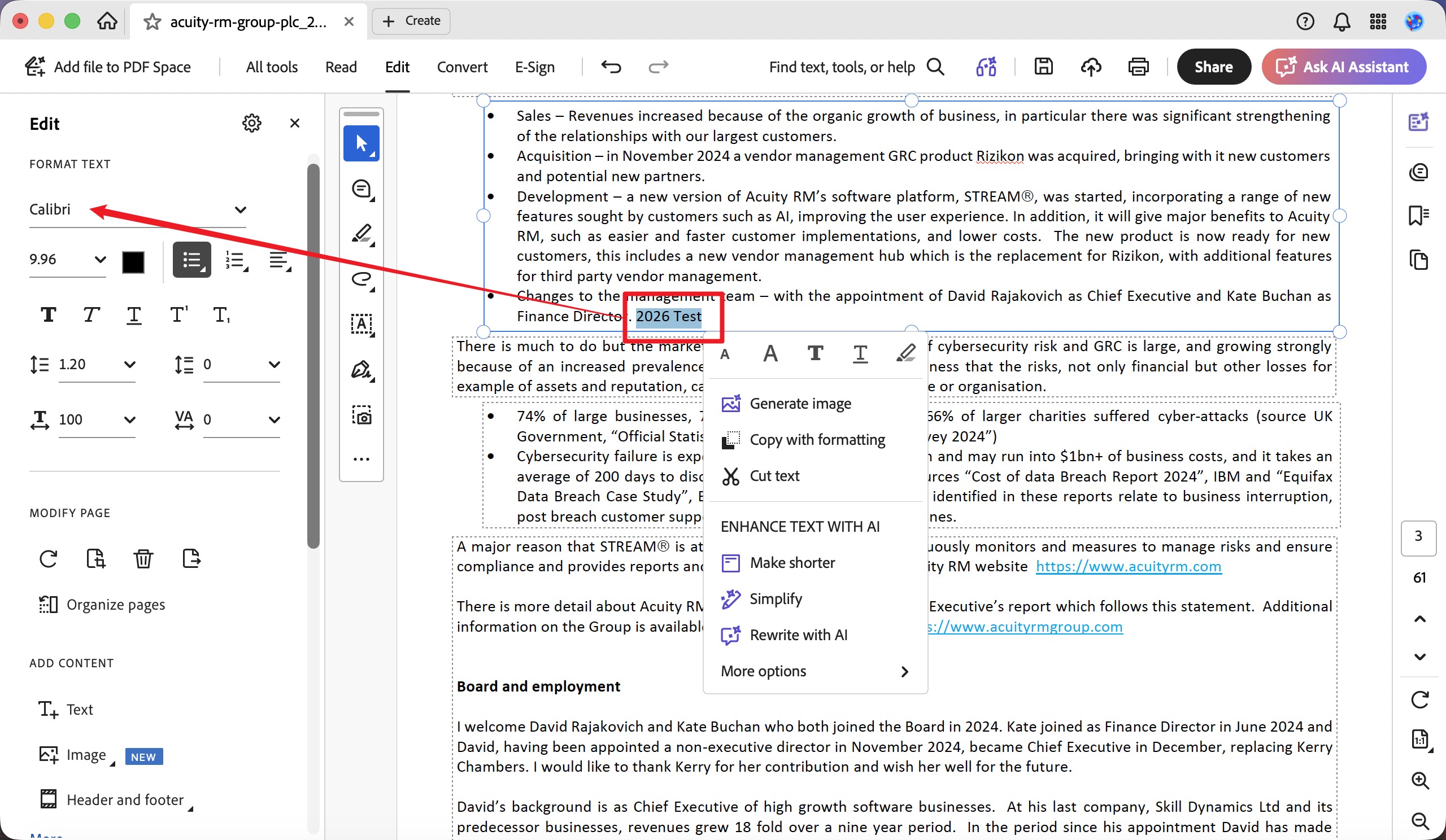
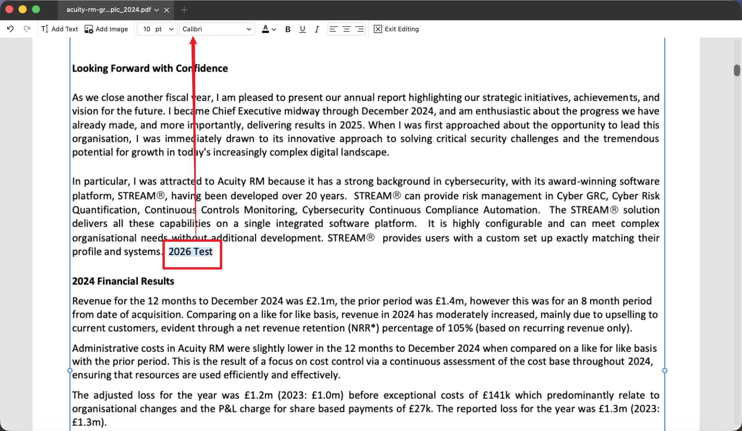
Neither behaviour is wrong — they suit opposite needs. If you want text you carefully formatted in Word to arrive in the PDF looking the same, UPDF's default does that in one step. If instead you want pasted text to blend into the PDF's existing paragraph, that is the default in Acrobat and PDFgear.
The reason this ends up in UPDF's favour is that UPDF does both, and the other two only do one. When you want the paste to match the PDF block rather than keep the Word styling, UPDF offers right-click → Paste Unformatted Text, and the pasted words then follow the destination Calibri style just like the other tools.
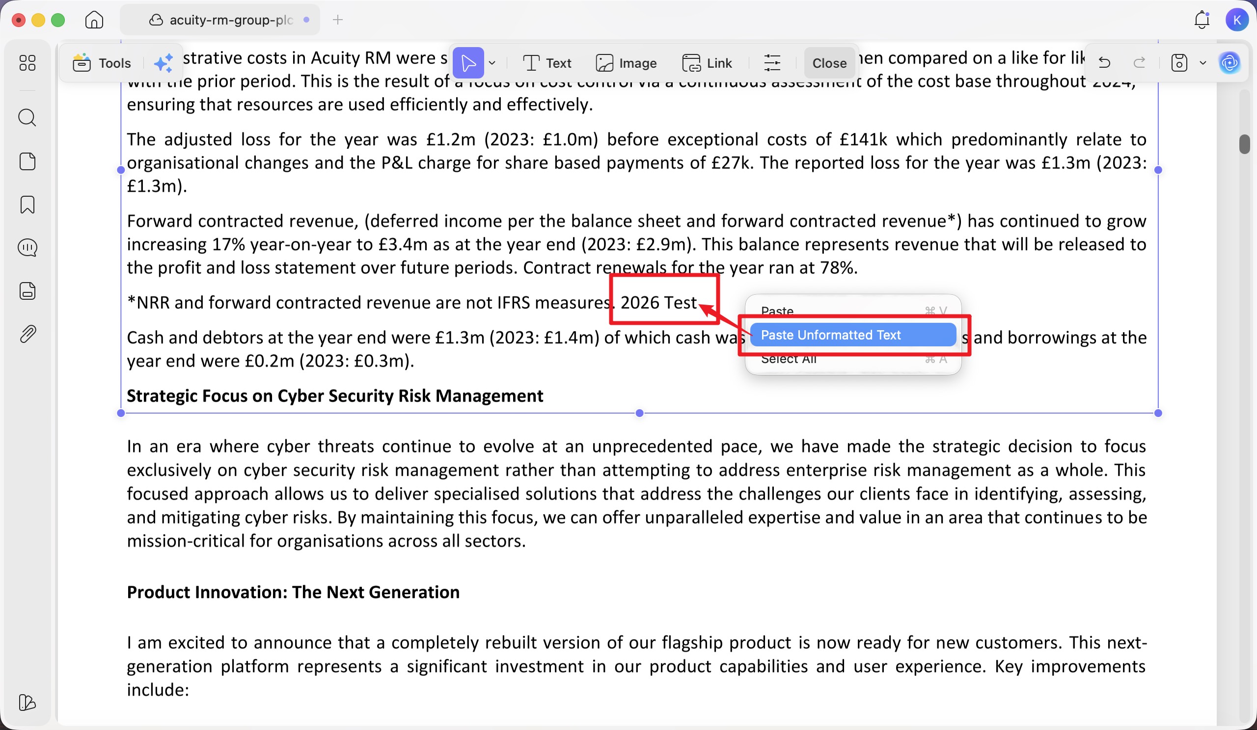
So UPDF covers both workflows; Acrobat and PDFgear give you only the destination-style result, with no built-in way to keep the source formatting on paste.
The practical takeaway: if part of your job is moving richly formatted text from Word into PDFs, UPDF is the only one of the three that lets you choose whether to keep the source look or adopt the PDF's — a small feature that saves real re-formatting time.
Hit the button below to get UPDF free and give it a try.
Windows • macOS • iOS • Android 100% secure
Part 9. The pattern across all seven files
Three findings held consistently, and each one is more useful than the overall ranking:
- Same-length edits are a solved problem; length is what breaks things. Every tool passed the baseline (E1). Every failure that mattered appeared when the replacement text was longer or the font was not installed. If your edits are simple substitutions, any of these tools works — the choice only matters under pressure.
- "Font kept" and "layout kept" are different skills. UPDF kept the font 6/6 but layout 4/6; Acrobat kept layout on E5 but lost the font there. A tool can nail one and miss the other on the same file, which is why we scored them separately — and why "it looked fine at first glance" is not enough.
- The most dangerous failures are the silent ones. A number that wraps inside a table cell (Acrobat, E2) or a font that flips to Helvetica while the text stays correct (PDFgear, E1) both pass a quick visual check. Those are the edits that ship looking wrong. UPDF's advantage was less about spectacular wins and more about not producing these quiet defects.
Part 10. Can the failures be fixed by hand?
A failed first pass is not always a dead end, so it is fair to ask what recovery costs. A wrapped table number (Acrobat E2) can sometimes be coaxed back onto one line by widening the text box or nudging the font size — a minute or two of manual work. A font substitution (Acrobat E5, PDFgear E1/E2/E4) is harder: if the original font is not installed on your machine, no tool can truly restore it; you can only pick the closest available substitute, which is not the same thing. That is the practical case for a tool that keeps the font automatically on the first pass — it removes the one failure you cannot reliably fix afterward.
Part 11. What we did not test
To keep this fair, be clear about its edges. This was an English-language, macOS desktop test, one frozen edit per file, scored once by a single reviewer against before/after screenshots. It did not measure conversion, annotation, form building, e-signatures, batch editing, mobile apps, or team features, and it is not a claim about which application is the better all-round PDF editor. Font availability is machine-specific — a font that substituted on this Mac might be present on another computer and behave differently — so treat the E5 result as "how each tool handles a missing font," not a universal verdict on that typeface. A different set of files could shift individual scores, though the overall pattern (UPDF kept the font every time; length and missing fonts caused every real failure) was consistent across all seven.
Part 12. FAQs
1. Why does my font change to Helvetica (or Arial) when I edit a PDF?
Because the original font is not installed on your computer, or the PDF embedded only a subset of it. When you type new characters the editor has no glyphs to use, so some tools silently swap in a default like Helvetica. In this test that happened repeatedly with PDFgear and once with Acrobat (which substituted Minion Pro). The fix is either to install the original font, or to use an editor that preserves the embedded font automatically — our guide on editing a PDF while keeping the same font covers both routes.
2. Does editing text in a PDF always ruin the layout?
No — for same-length edits the layout is almost always fine. Layout problems appear when the new text is longer than the old text: it has to go somewhere, so it reflows, wraps, or overflows. The best tools reflow cleanly and keep the text inside its original block; the worst let it collide with neighbouring lines or columns.
3. Can free PDF editors keep the original formatting?
For simple, same-length edits, yes — PDFgear kept the layout correct on the easy cases. But free tools are where formatting most often breaks under pressure: in this test PDFgear substituted the font in three of six files and overlapped lines on the harder layouts. If the document will be sent or published, verify the font and spacing before trusting a free-tool edit.
4. Which tool is best for editing scanned PDFs?
Adobe Acrobat produced the cleanest scanned-text edit here (E7), keeping the font and removing the original image text with no ghosting. UPDF also edited the scanned text successfully in place. PDFgear could not — its OCR only extracts text to copy or export, with no in-place editing of the scanned page.
5. Is a font substitution really a "failure" if the text is correct?
For most professional documents, yes. A contract, report, or branded page that suddenly mixes Helvetica into a Calibri paragraph looks wrong to any reader, even though every word is correct. That is why this test treats a visible font-family change as a critical failure — it is the defect most likely to make an otherwise-correct edit unusable.
6. What happens when I paste formatted text from Word into a PDF?
It depends on the tool. In this test, UPDF kept the source formatting by default — text styled Century Gothic bold red in Word arrived in the PDF looking the same — while Acrobat and PDFgear re-styled the paste to match the destination paragraph. UPDF is the only one of the three that does both: paste normally to keep the Word styling, or right-click → Paste Unformatted Text to make it adopt the PDF block's style instead. If you regularly move formatted text from Word into PDFs, that choice is worth having.
Hit the button below to get UPDF free and give it a try.
Windows • macOS • iOS • Android 100% secure
The verdict
Across seven real PDFs, UPDF was the tool that most reliably kept the document looking like itself after an edit — it preserved the original font in every file and passed all six digital-text edits on the first try. Its only softer spot was pixel-perfect layout when text got genuinely longer, where it reflowed cleanly rather than perfectly. Adobe Acrobat was close and was the best choice for scanned pages, but it substituted a brand font on one file and wrapped a number inside a table cell on another — two silent failures that matter in professional work. PDFgear is a capable free option for simple swaps, but repeated font substitutions and overlapping text make it risky for anything you will send.
If your edits are simple same-length swaps, any of these will do. If they involve longer text, custom fonts, tables, or documents you cannot afford to have look wrong, UPDF was the safest default in this test.
The fastest way to see it for yourself: open a PDF you care about, change one line, save it, reopen it, and check whether the font, the spacing, and the line breaks all survived. Download UPDF and try that on your own file — it takes five minutes and tells you more than any walkthrough.
Windows • macOS • iOS • Android 100% secure




 Enid Brown
 Enrica Taylor
Click here for the full data appendix.