PDFs have recently been very popular, especially after the COVID-19 outbreak. Most of the students and professionals handled their work through PDFs related to education or business fields. Moreover, managing and filling forms has been a major hassle due to PDF editing software limitations and the inability to edit forms. However, UPDF's latest version, 1.6.8 release for Windows, has made form creation and editing easier.
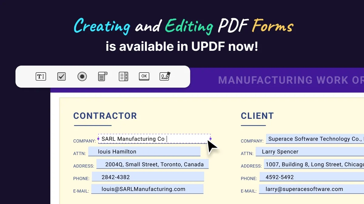
This tool is breaking the barriers to bring all the new exciting and helpful features to its users. The newly integrated Edit Form feature lets you edit and insert 6 new fields into your PDF forms. This guide will help you explore this new feature in detail. Furthermore, we will also discuss how to insert these fields and customize them based on your requirements.
A Detailed Overview of the PDF Form Creation and Editing Feature in UPDF
As we know how important PDF forms are in our daily routines, we must take precautions and avoid using tools that can mess up our work. In that case, UPDF is the top-notch tool to help you create, edit and fill PDF forms within a few clicks. You can now use insert form fields of your choice and customize them per requirements. Explore all you need to learn about the form creation feature in the following sections.
1. Text Field
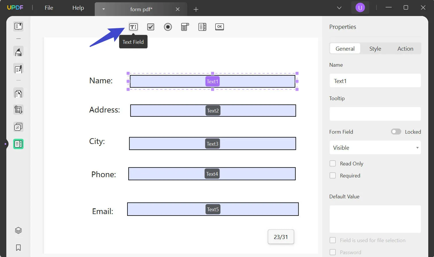
When you enable the "Edit Form" from the left-side panel in UPDF, the first feature you get is the text field. When you insert this field, you can now name it and define the tooltip for it to give an idea to users about this field when they hover their cursor. Moreover, you can restrict or lock it and select from the four options to make it "Visible," "Hidden," "Visible but Doesn't Print," or "Hidden but Printable."
Moreover, customize it further by making it "Read Only" or "Required." Also, set the "Default Value" and tailor it by tick marking from the seven options. These options include file selection, password, spell check, multi-line, scrolling, rich text formatting, and setting character limits. Then as for style, users can set the appearance color for the border, fill, and text separately.
Setting alignment, resizing, and formatting to five different options is yet another feature of this tool. Once you select the format, you can customize it by tapping the "Gear" icon. In the "Action" tab, you can choose a trigger from the six options and add it to your text field.
2. Check Box
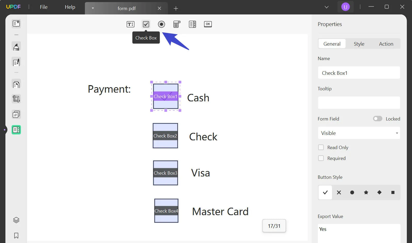
This field offers various similar options we have already discussed for the text field. Such as typing the field name, defining the tooltip, and restricting the form field. However, the additional option you get is choosing the "Button Style" from the six available options, such as tick, cross, circle, and many more.
Moreover, you can also set the style with different colors and resize this field box. Export value is another added option to assign the required text for this field to help the user fill the textbox using any text.
3. Radio Button
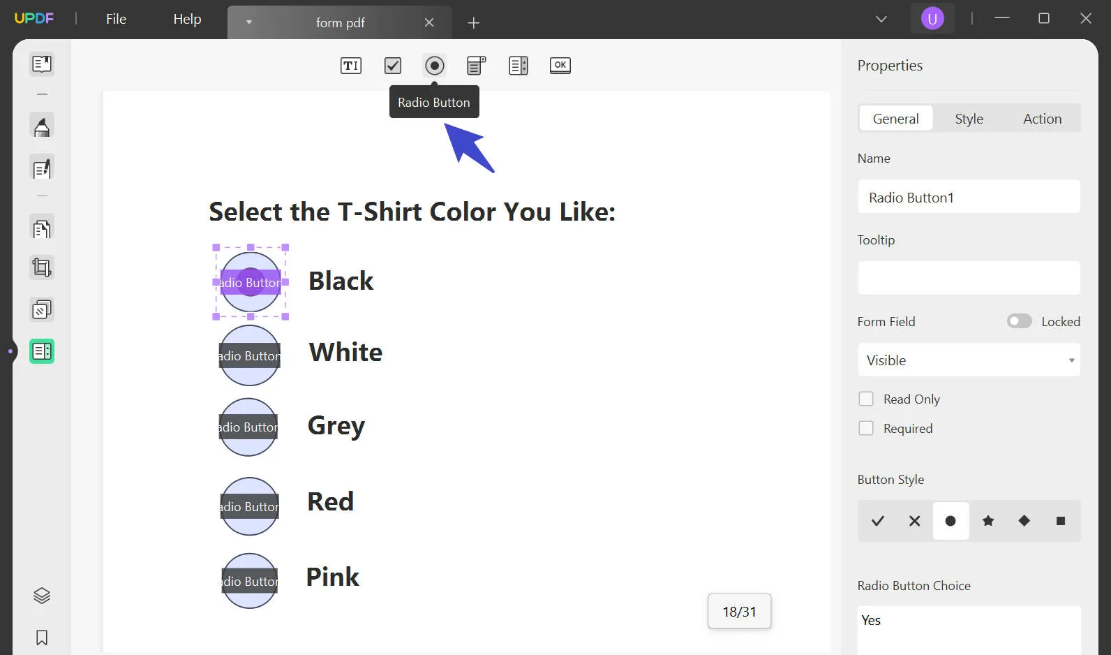
This button lets you handle it the same way as the text field and check box. You can start by naming the button and choosing a tooltip to help users learn what this button does. Moreover, you can customize the form field to apply any restrictions and set the style of the button as needed. Additionally, you can set it to check this button by default or choose the button in unison if they contain the same name and choices.
Further, you can differentiate the button by setting the customized color for the border, fill, and text or resize the button to set the specific trigger. Once it is triggered, you can set it from the four different actions.
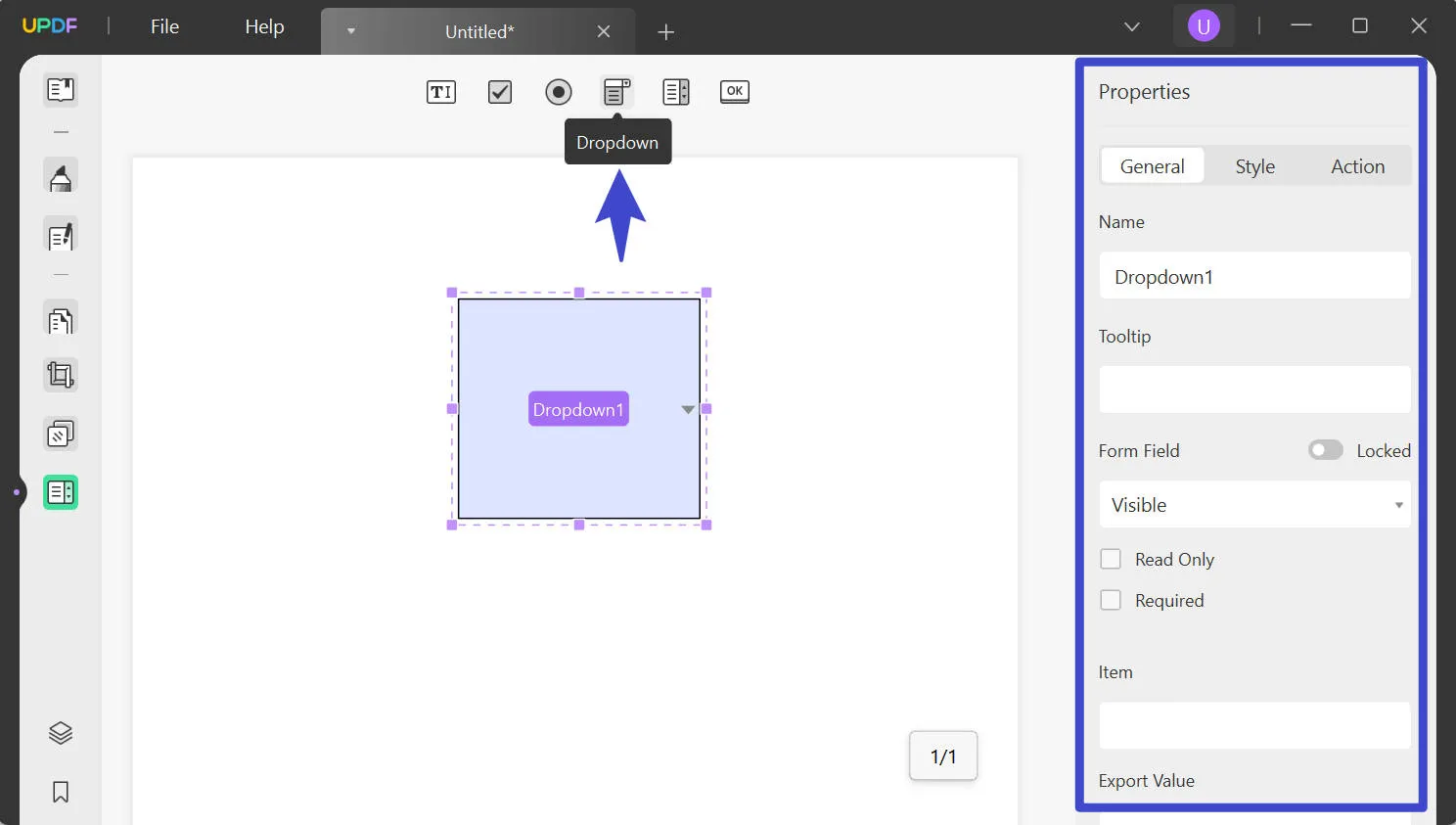
4. Drop-Down
Apart from the basic features that are the same in all the fields, you get to add items to the list, and they will appear in the drop-down. Also, you get to see the items list in real time as you insert each item. Head over to choose to sort the items, enable entering custom text, check for spelling, and set the default choice when opening forms. Calculating the format value is also an added feature in this.
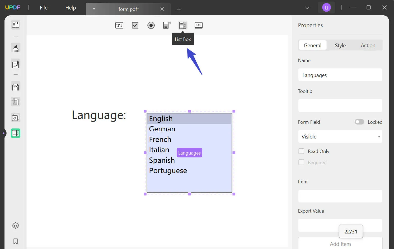
5. List Box
This box enables users to list the items in a sequence and even lets the user select multiple items by choosing the "Multiple Selection" box. Moreover, set the style with different combinations of colors and choose from the variety of text styles and manage the font size for it.
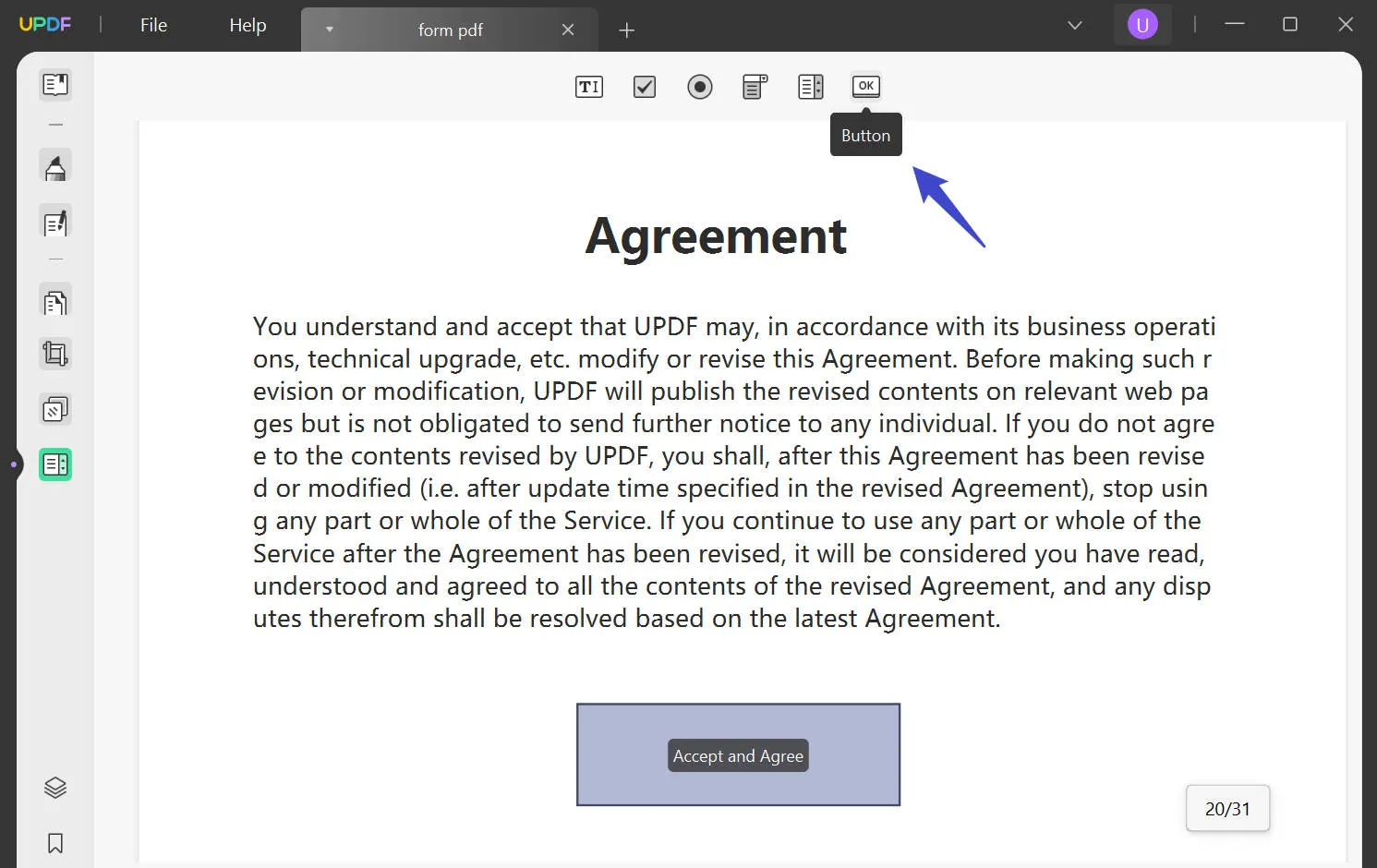
6. Button
This button that we are going to discuss here highly resembles the radio button. However, the difference is that the users can click this button to head to the page view, a web page, reset a form, or hide/show a particular field. This can be done once you trigger an action to it.
Users can also choose the layout of this button from seven options and name that icon or a label. For further icon customization, browse your device and integrate a particular image.
The Way to Upgrade to 1.6.8 Version for Windows
As discussed, the Edit Form feature has already been released and integrated into the UPDF tool. If you cannot track it, you will need to upgrade the UPDF to take advantage of this new feature. You can do so through the built-in "Help" tab when you access the tool. After clicking this tab, tap "Check for Updates" and install the new 1.6.8 version for Windows.
Alternatively, click the "Free Download" button to install the latest version of UPDF immediately!
Windows • macOS • iOS • Android 100% secure
 UPDF
UPDF
 UPDF for Windows
 UPDF for Mac
 UPDF for iPhone/iPad
 UPDF for Android
 UPDF AI Online
 UPDF Sign
 Edit PDF
 Annotate PDF
 Create PDF
 PDF Form
 Edit links
 Convert PDF
 OCR
OCR PDF to Word
 PDF to Image
 PDF to Excel
 Organize PDF
 Merge PDF
 Split PDF
 Crop PDF
 Rotate PDF
 Protect PDF
 Sign PDF
 Redact PDF
 Sanitize PDF
 Remove Security
 Read PDF
 UPDF Cloud
 Compress PDF
 Print PDF
 Batch Process
 About UPDF AI
 UPDF AI Solutions
 AI User Guide
 FAQ about UPDF AI
 Summarize PDF
 Translate PDF
 Chat with PDF
 Chat with AI
 Chat with image
 PDF to Mind Map
 Explain PDF
 Scholar Research
 Paper Search
 AI Proofreader
 AI Writer
 AI Homework Helper
 AI Quiz Generator
 AI Math Solver
 PDF to Word
 PDF to Excel
 PDF to PowerPoint
 User Guide
 UPDF Tricks
 FAQs
FAQs UPDF Reviews
 Download Center
 Blog
Blog Newsroom
 Tech Spec
 Updates
 UPDF vs. Adobe Acrobat
 UPDF vs. Foxit
 UPDF vs. PDF Expert